Components
Intrinsic components the model can emit through the present tool, rendered here through the styled library.
Layout
Card
A bordered container grouping related content. Optionally titled. Set asForm to collect named child control values on submit, and confirm/cancel to add a footer with action buttons.
- Total
- $48.00
{ "$type": "Card", "title": "Order summary", "children": [ { "$type": "Text", "value": "Two items ready for checkout.", "size": "sm", "color": "secondary" }, { "$type": "Fact", "label": "Total", "value": "$48.00" } ]}| Prop | Type | Description |
|---|---|---|
| title | string | Optional card title. |
| padding | number | Padding in 4px units (e.g. 2 = 8px). 0 to 8 is the supported range. |
| background | string | Background color or gradient (any CSS background value). Setting this also switches the card's own text to white, since a custom background makes the card a tinted surface; children can still opt into a different color explicitly. |
| asForm | boolean | Render as a form; submitting it fires confirm.$action with every named child control's value, keyed by name. |
| confirm | object | Confirm button shown in the footer. |
| cancel | object | Cancel button shown in the footer. |
Row
A horizontal row; children laid out left to right.
{ "$type": "Row", "gap": 2, "align": "center", "children": [ { "$type": "Badge", "value": "In stock", "variant": "success" }, { "$type": "Badge", "value": "Free shipping", "variant": "info" }, { "$type": "Text", "value": "Ships today", "size": "sm", "color": "secondary" } ]}| Prop | Type | Description |
|---|---|---|
| gap | number | Gap between children in 4px units. 0 to 8 is the supported range. |
| align | enumstartcenterend | Cross-axis alignment. |
| justify | enumstartcenterendbetween | Main-axis distribution. |
Col
A vertical stack; children laid out top to bottom.
Shipping address
142 Market StreetSan Francisco, CA 94105{ "$type": "Col", "gap": 2, "children": [ { "$type": "Header", "text": "Shipping address", "size": "md" }, { "$type": "Text", "value": "142 Market Street", "size": "sm" }, { "$type": "Text", "value": "San Francisco, CA 94105", "size": "sm" } ]}| Prop | Type | Description |
|---|---|---|
| gap | number | Gap between children in 4px units. 0 to 8 is the supported range. |
| align | enumstartcenterend | Cross-axis alignment. |
Box
A generic container for composition, e.g. a progress bar built from an outer track Box containing a partial-width fill Box. Size, radius, and background accept arbitrary values, so they render as inline styles rather than data-attribute hooks.
{ "$type": "Box", "width": "100%", "height": 8, "radius": "full", "background": "rgba(59, 130, 246, 0.2)", "children": { "$type": "Box", "width": "62%", "height": 8, "radius": "full", "background": "#3b82f6" }}| Prop | Type | Description |
|---|---|---|
| width | string | number | Width; a number is pixels. |
| height | string | number | Height; a number is pixels. |
| radius | enum | numberfull | Corner radius; "full" is a pill/circle, a number is pixels. |
| background | string | Background color or gradient (any CSS background value). |
Spacer
Empty space that pushes neighbors apart.
{ "$type": "Row", "align": "center", "children": [ { "$type": "Text", "value": "Subtotal", "size": "sm" }, { "$type": "Spacer" }, { "$type": "Text", "value": "$36.00", "weight": "medium" } ]}Divider
A horizontal rule between sections.
Manage how we notify you about activity.
{ "$type": "Col", "gap": 3, "children": [ { "$type": "Text", "value": "Account settings", "weight": "medium" }, { "$type": "Divider" }, { "$type": "Text", "value": "Manage how we notify you about activity.", "size": "sm", "color": "secondary" } ]}| Prop | Type | Description |
|---|---|---|
| flush | boolean | Whether the divider spans the full width with no inset. |
Carousel
A horizontally scrollable group of Card children (max 10). Set label for an accessible name.
{ "$type": "Carousel", "label": "Featured stays", "children": [ { "$type": "Card", "title": "Riverside loft", "children": { "$type": "Text", "value": "$186 / night · 2 guests", "size": "sm", "color": "secondary" } }, { "$type": "Card", "title": "Hillside cabin", "children": { "$type": "Text", "value": "$142 / night · 4 guests", "size": "sm", "color": "secondary" } }, { "$type": "Card", "title": "Harbor suite", "children": { "$type": "Text", "value": "$210 / night · 2 guests", "size": "sm", "color": "secondary" } } ]}| Prop | Type | Description |
|---|---|---|
| label | string | Accessible label for the carousel. |
Typography
Header
A section heading. Renders as a bold title.
Weekly digest
{ "$type": "Header", "text": "Weekly digest", "size": "xl"}| Prop | Type | Description |
|---|---|---|
| textrequired | string | The heading text. |
| size | enumsmmdlgxl2xl3xl | Heading size; defaults to lg. |
Text
A run of text. Use for paragraphs, labels, or inline copy.
{ "$type": "Col", "gap": 2, "children": [ { "$type": "Text", "value": "Primary body copy at the default size.", "size": "md", "weight": "normal" }, { "$type": "Text", "value": "Emphasized supporting line.", "size": "sm", "weight": "semibold", "color": "secondary" } ]}| Prop | Type | Description |
|---|---|---|
| valuerequired | string | The text content. |
| size | enumsmmdlgxl2xl3xl | Text size; defaults to md. |
| weight | enumnormalmediumsemiboldbold | Font weight. |
| color | enumemphasissecondaryalpha-70whitewhite-70white-50 | Foreground color token. |
Caption
Secondary, de-emphasized text under a primary element.
Last updated 2 hours ago
{ "$type": "Caption", "value": "Last updated 2 hours ago"}| Prop | Type | Description |
|---|---|---|
| valuerequired | string | The caption text. |
Markdown
A markdown string. Rendered as-is by default; override this component for a full markdown renderer.
Refund approved. Your card ending in 4242 will be credited within 3 to 5 business days.
{ "$type": "Markdown", "value": "**Refund approved.** Your card ending in 4242 will be credited within **3 to 5 business days**."}| Prop | Type | Description |
|---|---|---|
| valuerequired | string | Markdown source. |
Data
Fact
A label/value pair, rendered as a key followed by its value. Use for compact metadata.
- Status
- Shipped
{ "$type": "Fact", "label": "Status", "value": "Shipped"}| Prop | Type | Description |
|---|---|---|
| labelrequired | string | The fact label (key). |
| valuerequired | string | The fact value. |
Table
Tabular data. Provide columns and rows; each row is an array of cells matching the columns.
| Symbol | Shares | Price | Value |
|---|---|---|---|
| ACME | 40 | $182.10 | $7,284.00 |
| GLBX | 25 | $94.55 | $2,363.75 |
| NORT | 15 | $310.20 | $4,653.00 |
{ "$type": "Table", "columns": [ { "label": "Symbol" }, { "label": "Shares" }, { "label": "Price" }, { "label": "Value" } ], "rows": [ [ "ACME", 40, "$182.10", "$7,284.00" ], [ "GLBX", 25, "$94.55", "$2,363.75" ], [ "NORT", 15, "$310.20", "$4,653.00" ] ]}| Prop | Type | Description |
|---|---|---|
| columns | object[] | Column definitions. |
| rows | string | number | boolean[][] | Rows of cells. |
Chart
A chart. variant selects bar, line, sparkline, or area rendering. Provide data for a single series, or series for multiple named series (series takes precedence over data when both are present). Set stacked to accumulate series values instead of overlaying them, and showAxis/showLegend to add y-axis ticks, x-axis point labels, and a legend.
{ "$type": "Chart", "variant": "bar", "stacked": true, "showAxis": true, "showLegend": true, "series": [ { "label": "Email", "data": [ { "label": "W1", "value": 42 }, { "label": "W2", "value": 38 }, { "label": "W3", "value": 51 }, { "label": "W4", "value": 35 } ] }, { "label": "Chat", "data": [ { "label": "W1", "value": 28 }, { "label": "W2", "value": 33 }, { "label": "W3", "value": 25 }, { "label": "W4", "value": 40 } ] }, { "label": "Phone", "data": [ { "label": "W1", "value": 12 }, { "label": "W2", "value": 9 }, { "label": "W3", "value": 15 }, { "label": "W4", "value": 11 } ] } ]}| Prop | Type | Description |
|---|---|---|
| variantrequired | enumbarlinesparklinearea | Chart variant. |
| data | object[] | Data points for a single series. |
| series | object[] | Multiple named series; takes precedence over data when present. |
| stacked | boolean | Accumulate series values instead of overlaying them (bar and area variants; ignored for line and sparkline). |
| showAxis | boolean | Show y-axis ticks and x-axis point labels. |
| showLegend | boolean | Show a legend mapping each series to its color. |
| color | string | Series color (single-series mode only). One of emphasis, secondary, alpha-70, white, white-70, or white-50, matching Text's color tokens; other values have no visual effect. |
Badge
A small labeled tag, e.g. for status or category.
{ "$type": "Row", "gap": 2, "children": [ { "$type": "Badge", "value": "Default" }, { "$type": "Badge", "value": "Secondary", "variant": "secondary" }, { "$type": "Badge", "value": "Info", "variant": "info" }, { "$type": "Badge", "value": "Success", "variant": "success" }, { "$type": "Badge", "value": "Warning", "variant": "warning" } ]}| Prop | Type | Description |
|---|---|---|
| valuerequired | string | Badge text. |
| variant | string | Visual variant token. |
Media
Image
An image. Provide src and alt for accessibility.
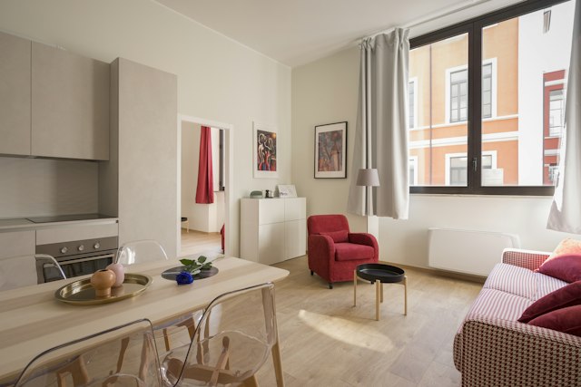
{ "$type": "Image", "src": "https://images.unsplash.com/photo-1522708323590-d24dbb6b0267?w=640&q=80", "alt": "Bright loft living room with large windows and a sofa", "size": "md"}| Prop | Type | Description |
|---|---|---|
| srcrequired | string | Image URL. |
| altrequired | string | Alt text for accessibility. |
| size | enum | numbersmmdlg | Size token or pixel value. |
| round | boolean | Render as a circular avatar (fully rounded, cropped to a square). |
Icon
A small line icon from the built-in set. size controls the rendered pixel size.
{ "$type": "Row", "gap": 4, "align": "center", "children": [ { "$type": "Icon", "name": "sun", "size": "md" }, { "$type": "Icon", "name": "plane", "size": "md" }, { "$type": "Icon", "name": "map-pin", "size": "md" }, { "$type": "Icon", "name": "credit-card", "size": "md" }, { "$type": "Icon", "name": "bell", "size": "md" } ]}| Prop | Type | Description |
|---|---|---|
| namerequired | enumsunmooncloudrainsnowwindplaypausecheckxstarheartarrow-rightarrow-up-rightchevron-rightcalendarclockmap-pinplanetruckcredit-cardusersearchbell | Which built-in icon to render. |
| size | enumsmmdlg | Icon size; defaults to md (16px). |
Built-in icon set
Controls
Button
A clickable button. Carries $action describing the side effect or resume value. Set submit to submit an ancestor Form/Card instead of firing $action on click.
{ "$type": "Row", "gap": 2, "children": [ { "$type": "Button", "label": "Add to cart", "buttonStyle": "primary", "$action": { "type": "add_to_cart", "sku": "headphone-pro-1" } }, { "$type": "Button", "label": "Save", "buttonStyle": "secondary", "$action": { "type": "save_item", "sku": "headphone-pro-1" } }, { "$type": "Button", "label": "Details", "buttonStyle": "outline", "$action": { "type": "view_details", "sku": "headphone-pro-1" } }, { "$type": "Button", "label": "Share", "buttonStyle": "ghost", "$action": { "type": "share_item", "sku": "headphone-pro-1" } }, { "$type": "Button", "label": "Remove", "buttonStyle": "danger", "$action": { "type": "remove_item", "sku": "headphone-pro-1" } } ]}| Prop | Type | Description |
|---|---|---|
| labelrequired | string | Button label. |
| buttonStyle | enumprimarysecondaryoutlineghostdanger | Visual style. |
| block | boolean | Whether the button spans the full width. |
| submit | boolean | Render as a submit button for an ancestor Form/Card instead of a click button. |
Select
A dropdown selector. Carries $action describing the on-select behavior.
{ "$type": "Select", "name": "partySize", "label": "Party size", "placeholder": "Select party size", "options": [ { "label": "1 guest", "value": "1" }, { "label": "2 guests", "value": "2" }, { "label": "3 guests", "value": "3" }, { "label": "4+ guests", "value": "4" } ], "$action": { "type": "set_party_size" }}| Prop | Type | Description |
|---|---|---|
| optionsrequired | object[] | Selectable options. |
| placeholder | string | Placeholder shown when nothing is selected. |
| label | string | Accessible label for the control. |
| name | string | Field name used inside a Form. |
Input
A text input. Carries $action describing the on-submit behavior.
{ "$type": "Input", "name": "email", "label": "Email", "placeholder": "[email protected]", "$action": { "type": "submit_email" }}| Prop | Type | Description |
|---|---|---|
| placeholder | string | Placeholder text. |
| multiline | boolean | Render a textarea instead of a single-line input. |
| label | string | Accessible label for the control. |
| name | string | Field name used inside a Form. |
DatePicker
A date input. Carries $action describing the on-select behavior.
{ "$type": "DatePicker", "name": "checkIn", "label": "Check-in date", "value": "2026-07-15", "min": "2026-07-01", "max": "2026-12-31", "$action": { "type": "set_check_in" }}| Prop | Type | Description |
|---|---|---|
| value | string | Initial date (YYYY-MM-DD). |
| min | string | Minimum date (YYYY-MM-DD). |
| max | string | Maximum date (YYYY-MM-DD). |
| label | string | Accessible label for the control. |
| name | string | Field name used inside a Form. |
Checkbox
A checkbox with a label. Carries $action describing the on-change behavior.
{ "$type": "Checkbox", "name": "reminder", "label": "Send a reminder 1 hour before", "defaultChecked": true, "$action": { "type": "toggle_reminder" }}| Prop | Type | Description |
|---|---|---|
| labelrequired | string | Label text next to the checkbox. |
| name | string | Field name used inside a Form. |
| defaultChecked | boolean | Whether the checkbox starts checked. |
RadioGroup
A group of mutually exclusive radio options. Carries $action describing the on-change behavior.
{ "$type": "RadioGroup", "name": "seating", "label": "Seating preference", "defaultValue": "indoor", "options": [ { "label": "Indoor", "value": "indoor" }, { "label": "Patio", "value": "patio" }, { "label": "Bar", "value": "bar" } ], "$action": { "type": "set_seating" }}| Prop | Type | Description |
|---|---|---|
| optionsrequired | object[] | Selectable options. |
| name | string | Field name used inside a Form. |
| label | string | Accessible name for the group. |
| defaultValue | string | Initially selected value. |
Form
Wraps named child controls (Select/Input/Checkbox/RadioGroup/DatePicker with a name). Carries $action; on submit it fires with every named control's value, keyed by name.
{ "$type": "Form", "gap": 3, "$action": { "type": "submit_newsletter" }, "children": [ { "$type": "Input", "name": "name", "label": "Name", "placeholder": "Full name" }, { "$type": "Input", "name": "email", "label": "Email", "placeholder": "[email protected]" }, { "$type": "Button", "label": "Subscribe", "buttonStyle": "primary", "submit": true } ]}| Prop | Type | Description |
|---|---|---|
| gap | number | Gap between children in 4px units. 0 to 8 is the supported range. |
Lists
ListView
A vertical list container. Wrap ListViewItem children as rows.
- Morning Light3:42
Aria Sol
- City After Rain4:18
Northline
- Quiet Hours2:55
Lumen



{ "$type": "ListView", "children": [ { "$type": "ListViewItem", "$action": { "type": "play_track", "trackId": "t1" }, "children": { "$type": "Row", "align": "center", "gap": 3, "children": [ { "$type": "Image", "src": "https://images.unsplash.com/photo-1505740420928-5e560c06d30e?w=640&q=80", "alt": "Over-ear headphones on a desk", "size": "sm", "round": true }, { "$type": "Col", "gap": 0, "children": [ { "$type": "Text", "value": "Morning Light", "weight": "medium" }, { "$type": "Caption", "value": "Aria Sol" } ] }, { "$type": "Spacer" }, { "$type": "Text", "value": "3:42", "size": "sm", "color": "secondary" } ] } }, { "$type": "ListViewItem", "$action": { "type": "play_track", "trackId": "t2" }, "children": { "$type": "Row", "align": "center", "gap": 3, "children": [ { "$type": "Image", "src": "https://images.unsplash.com/photo-1471478331149-c72f17e33c73?w=640&q=80", "alt": "Vinyl records stacked on a shelf", "size": "sm", "round": true }, { "$type": "Col", "gap": 0, "children": [ { "$type": "Text", "value": "City After Rain", "weight": "medium" }, { "$type": "Caption", "value": "Northline" } ] }, { "$type": "Spacer" }, { "$type": "Text", "value": "4:18", "size": "sm", "color": "secondary" } ] } }, { "$type": "ListViewItem", "$action": { "type": "play_track", "trackId": "t3" }, "children": { "$type": "Row", "align": "center", "gap": 3, "children": [ { "$type": "Image", "src": "https://images.unsplash.com/photo-1516280440614-37939bbacd81?w=640&q=80", "alt": "Singer performing under stage lights", "size": "sm", "round": true }, { "$type": "Col", "gap": 0, "children": [ { "$type": "Text", "value": "Quiet Hours", "weight": "medium" }, { "$type": "Caption", "value": "Lumen" } ] }, { "$type": "Spacer" }, { "$type": "Text", "value": "2:55", "size": "sm", "color": "secondary" } ] } } ]}ListViewItem
A row inside a ListView. Carries $action to make the whole row clickable and keyboard-activatable.
Estimated 2:00 to 4:00 PM
{ "$type": "ListViewItem", "$action": { "type": "view_order_event", "eventId": "transit" }, "children": { "$type": "Row", "justify": "between", "align": "center", "children": [ { "$type": "Col", "gap": 1, "children": [ { "$type": "Text", "value": "Out for delivery", "weight": "medium" }, { "$type": "Caption", "value": "Estimated 2:00 to 4:00 PM" } ] }, { "$type": "Badge", "value": "In progress", "variant": "info" } ] }}Feedback
Alert
A highlighted message conveying urgency. tone drives the severity.
Invoice #1842 was paid in full on July 12.
Update the card on file before July 31 to avoid failed charges.
{ "$type": "Col", "gap": 3, "children": [ { "$type": "Alert", "tone": "info", "title": "Payment received", "description": "Invoice #1842 was paid in full on July 12." }, { "$type": "Alert", "tone": "warning", "title": "Card expiring soon", "description": "Update the card on file before July 31 to avoid failed charges." } ]}| Prop | Type | Description |
|---|---|---|
| title | string | Alert title. |
| description | string | Supporting description text. |
| tone | enuminfosuccesswarningdanger | Severity tone; defaults to info. |