Get assistant-ui running in 5 minutes with npm and your first chat component.
Quick Start
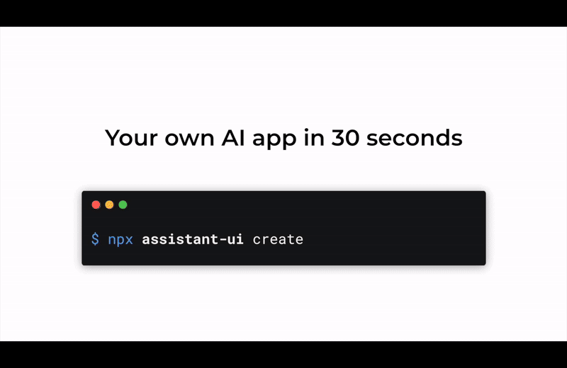
The fastest way to get started with assistant-ui.
Initialize assistant-ui
Create a new project:
npx assistant-ui@latest createOr choose a template:
# Minimal starter
npx assistant-ui@latest create -t minimal

# Assistant Cloud - with persistence and thread management
npx assistant-ui@latest create -t cloud

# Assistant Cloud + Clerk authentication
npx assistant-ui@latest create -t cloud-clerk

# LangGraph starter (react-langchain adapter)
npx assistant-ui@latest create -t langchain

# MCP starter template
npx assistant-ui@latest create -t mcp

# Eve agent starter template
npx assistant-ui@latest create -t eve
Add to an existing project:
npx assistant-ui@latest initAdd API key
Create a .env file with your API key:
OPENAI_API_KEY="sk-xxxxxxxxxxxxxxxxxxxxxxxxxxxxxxxxxxxxxxxx"Developing locally with a ChatGPT Plus or Pro plan? You can skip the API key and run on your subscription instead; see ChatGPT Subscription.
Start the app
npm run devManual Setup
If you prefer not to use the CLI, you can install components manually.
Add the assistant-ui registry to your components.json so the shadcn CLI resolves components for your style. Styles whose name starts with base- receive Base UI flavored components; all other styles receive the Radix flavored ones. npx shadcn init defaults to Base UI styles (for example base-nova), so new projects need this style-aware URL for components that compile against that stack.
{
  "registries": {
    "@assistant-ui": "https://r.assistant-ui.com/styles/{style}/{name}.json"
  }
}
Existing Radix projects can keep the plain form https://r.assistant-ui.com/{name}.json as a fallback (for example npx shadcn@latest add https://r.assistant-ui.com/thread.json).
Add assistant-ui
npx shadcn@latest add @assistant-ui/thread @assistant-ui/thread-listThe @assistant-uinamespace resolves the Radix or Base UI flavor from your project's style through the style-aware registry entry in components.json. Without that entry, add by direct URL instead:
npx shadcn@latest add https://r.assistant-ui.com/base/thread.json https://r.assistant-ui.com/base/thread-list.jsonPrerequisites
- Setup React
- Setup shadcn/ui
Follow the manual installation guide to configure:
- Tailwind CSS
- TypeScript path aliases
- tw-animate-css
- The cn helper
- components.json (for CLI usage)
Main Component
npm install @assistant-ui/react"use client";import { ComposerAddAttachment, ComposerAttachments, UserMessageAttachments,} from "@/components/assistant-ui/attachment";import { ThreadFollowupSuggestions } from "@/components/assistant-ui/follow-up-suggestions";import { MarkdownText } from "@/components/assistant-ui/markdown-text";import { Reasoning, ReasoningContent, ReasoningRoot, ReasoningText, ReasoningTrigger,} from "@/components/assistant-ui/reasoning";import { ToolFallback } from "@/components/assistant-ui/tool-fallback";import { ToolGroupContent, ToolGroupRoot, ToolGroupTrigger,} from "@/components/assistant-ui/tool-group";import { TooltipIconButton } from "@/components/assistant-ui/tooltip-icon-button";import { Button } from "@/components/ui/button";import { cn } from "@/lib/utils";import { ActionBarMorePrimitive, ActionBarPrimitive, AuiIf, type AssistantState, BranchPickerPrimitive, ComposerPrimitive, ErrorPrimitive, groupPartByType, MessagePrimitive, SuggestionPrimitive, ThreadPrimitive, type ToolCallMessagePartComponent, useAuiState,} from "@assistant-ui/react";import { ArrowDownIcon, ArrowUpIcon, CheckIcon, ChevronLeftIcon, ChevronRightIcon, CopyIcon, DownloadIcon, MicIcon, MoreHorizontalIcon, PencilIcon, RefreshCwIcon, SquareIcon,} from "lucide-react";import { createContext, useContext, type ComponentType, type FC, type PropsWithChildren,} from "react";export type ThreadGroupPart = MessagePrimitive.GroupedParts.GroupPart;/** * Optional component overrides for the thread. `AssistantMessage` and * `Welcome` replace whole sections; the remaining slots override how the * assistant message renders tool calls and part groups. Tool UIs registered * by name (toolkit `render`, `useAssistantDataUI`) take precedence over * `ToolFallback`. */export type ThreadComponents = { AssistantMessage?: ComponentType | undefined; Welcome?: ComponentType | undefined; ToolFallback?: ToolCallMessagePartComponent | undefined; ToolGroup?: | ComponentType<PropsWithChildren<{ group: ThreadGroupPart }>> | undefined; ReasoningGroup?: | ComponentType<PropsWithChildren<{ group: ThreadGroupPart }>> | undefined;};export type ThreadProps = { components?: ThreadComponents | undefined;};const EMPTY_COMPONENTS: ThreadComponents = {};const ThreadComponentsContext = createContext<ThreadComponents>(EMPTY_COMPONENTS);// Startup exposes a loading placeholder thread; treat it as a new chat so// the composer mounts centered. Loads after startup keep the docked layout.const isNewChatView = (s: AssistantState) => s.thread.messages.length === 0 && (!s.thread.isLoading || s.threads.isLoading);export const Thread: FC<ThreadProps> = ({ components = EMPTY_COMPONENTS }) => { const isEmpty = useAuiState(isNewChatView); return ( <ThreadComponentsContext.Provider value={components}> <ThreadRoot isEmpty={isEmpty} /> </ThreadComponentsContext.Provider> );};const ThreadRoot: FC<{ isEmpty: boolean }> = ({ isEmpty }) => { const { Welcome = ThreadWelcome } = useContext(ThreadComponentsContext); return ( <ThreadPrimitive.Root className="aui-root aui-thread-root bg-background @container flex h-full flex-col" style={{ ["--thread-max-width" as string]: "44rem", ["--composer-bg" as string]: "color-mix(in oklab, var(--color-muted) 30%, var(--color-background))", ["--composer-radius" as string]: "1.5rem", ["--composer-padding" as string]: "8px", }} > <ThreadPrimitive.Viewport turnAnchor="top" data-slot="aui_thread-viewport" className="relative flex flex-1 flex-col overflow-x-auto overflow-y-scroll scroll-smooth" > <div className={cn( "mx-auto flex w-full max-w-(--thread-max-width) flex-1 flex-col px-4 pt-4", isEmpty && "justify-center", )} > <AuiIf condition={isNewChatView}> <Welcome /> </AuiIf> <div data-slot="aui_message-group" className="mb-14 flex flex-col gap-y-6 empty:hidden" > <ThreadPrimitive.Messages> {() => <ThreadMessage />} </ThreadPrimitive.Messages> </div> <ThreadPrimitive.ViewportFooter className={cn( "aui-thread-viewport-footer bg-background flex flex-col gap-4 overflow-visible pb-4 md:pb-6", !isEmpty && "sticky bottom-0 mt-auto rounded-t-(--composer-radius)", )} > <ThreadScrollToBottom /> <ThreadFollowupSuggestions /> <Composer /> <AuiIf condition={(s) => isNewChatView(s) && s.composer.isEmpty}> <ThreadSuggestions /> </AuiIf> </ThreadPrimitive.ViewportFooter> </div> </ThreadPrimitive.Viewport> </ThreadPrimitive.Root> );};const ThreadMessage: FC = () => { const { AssistantMessage: AssistantMessageComponent = AssistantMessage } = useContext(ThreadComponentsContext); const role = useAuiState((s) => s.message.role); const isEditing = useAuiState((s) => s.message.composer.isEditing); if (isEditing) return <EditComposer />; if (role === "user") return <UserMessage />; return <AssistantMessageComponent />;};const ThreadScrollToBottom: FC = () => { return ( <ThreadPrimitive.ScrollToBottom asChild> <TooltipIconButton tooltip="Scroll to bottom" variant="outline" className="aui-thread-scroll-to-bottom dark:border-border dark:bg-background dark:hover:bg-accent absolute -top-12 z-10 self-center rounded-full p-4 disabled:invisible" > <ArrowDownIcon /> </TooltipIconButton> </ThreadPrimitive.ScrollToBottom> );};const ThreadWelcome: FC = () => { return ( <div className="aui-thread-welcome-root mb-6 flex flex-col items-center px-4 text-center"> <h1 className="aui-thread-welcome-message-inner fade-in slide-in-from-bottom-1 animate-in fill-mode-both text-2xl font-semibold duration-200"> How can I help you today? </h1> </div> );};const ThreadSuggestions: FC = () => { return ( <div className="aui-thread-welcome-suggestions flex w-full flex-wrap items-center justify-center gap-2 px-4"> <ThreadPrimitive.Suggestions> {() => <ThreadSuggestionItem />} </ThreadPrimitive.Suggestions> </div> );};const ThreadSuggestionItem: FC = () => { return ( <div className="aui-thread-welcome-suggestion-display fade-in slide-in-from-bottom-2 animate-in fill-mode-both duration-200"> <SuggestionPrimitive.Trigger send asChild> <Button variant="ghost" className="aui-thread-welcome-suggestion text-foreground hover:bg-muted border-border/60 h-auto gap-1.5 rounded-full border px-3.5 py-1.5 text-sm font-normal whitespace-nowrap transition-colors" > <SuggestionPrimitive.Title className="aui-thread-welcome-suggestion-text-1" /> <SuggestionPrimitive.Description className="aui-thread-welcome-suggestion-text-2 empty:hidden" /> </Button> </SuggestionPrimitive.Trigger> </div> );};const Composer: FC = () => { return ( <ComposerPrimitive.Root className="aui-composer-root relative flex w-full flex-col"> <ComposerPrimitive.AttachmentDropzone asChild> <div data-slot="aui_composer-shell" className="border-border/60 data-[dragging=true]:border-ring focus-within:border-border dark:border-muted-foreground/15 dark:focus-within:border-muted-foreground/30 flex w-full flex-col gap-2 rounded-(--composer-radius) border bg-(--composer-bg) p-(--composer-padding) shadow-[0_4px_16px_-8px_rgba(0,0,0,0.08),0_1px_2px_rgba(0,0,0,0.04)] transition-[border-color,box-shadow] focus-within:shadow-[0_6px_24px_-8px_rgba(0,0,0,0.12),0_1px_2px_rgba(0,0,0,0.05)] data-[dragging=true]:border-dashed data-[dragging=true]:bg-[color-mix(in_oklab,var(--color-accent)_50%,var(--color-background))] dark:shadow-none" > <ComposerAttachments /> <ComposerPrimitive.Input placeholder="Send a message..." className="aui-composer-input caret-primary placeholder:text-muted-foreground/80 max-h-32 min-h-10 w-full resize-none bg-transparent px-2.5 py-1 text-base outline-none" rows={1} autoFocus enterKeyHint="send" aria-label="Message input" /> <ComposerAction /> </div> </ComposerPrimitive.AttachmentDropzone> </ComposerPrimitive.Root> );};const ComposerAction: FC = () => { return ( <div className="aui-composer-action-wrapper relative flex items-center justify-between"> <ComposerAddAttachment /> <div className="flex items-center gap-1.5"> <AuiIf condition={(s) => s.thread.capabilities.dictation}> <AuiIf condition={(s) => s.composer.dictation == null}> <ComposerPrimitive.Dictate asChild> <TooltipIconButton tooltip="Voice input" side="bottom" type="button" variant="ghost" size="icon" className="aui-composer-dictate size-7 rounded-full" aria-label="Start voice input" > <MicIcon className="aui-composer-dictate-icon size-4" /> </TooltipIconButton> </ComposerPrimitive.Dictate> </AuiIf> <AuiIf condition={(s) => s.composer.dictation != null}> <ComposerPrimitive.StopDictation asChild> <TooltipIconButton tooltip="Stop dictation" side="bottom" type="button" variant="ghost" size="icon" className="aui-composer-stop-dictation text-destructive size-7 rounded-full" aria-label="Stop voice input" > <SquareIcon className="aui-composer-stop-dictation-icon size-3.5 animate-pulse fill-current" /> </TooltipIconButton> </ComposerPrimitive.StopDictation> </AuiIf> </AuiIf> <AuiIf condition={(s) => !s.thread.isRunning}> <ComposerPrimitive.Send asChild> <TooltipIconButton tooltip="Send message" side="bottom" type="button" variant="default" size="icon" className="aui-composer-send size-7 rounded-full" aria-label="Send message" > <ArrowUpIcon className="aui-composer-send-icon size-4.5" /> </TooltipIconButton> </ComposerPrimitive.Send> </AuiIf> <AuiIf condition={(s) => s.thread.isRunning}> <ComposerPrimitive.Cancel asChild> <Button type="button" variant="default" size="icon" className="aui-composer-cancel size-7 rounded-full" aria-label="Stop generating" > <SquareIcon className="aui-composer-cancel-icon size-3.5 fill-current" /> </Button> </ComposerPrimitive.Cancel> </AuiIf> </div> </div> );};const MessageError: FC = () => { return ( <MessagePrimitive.Error> <ErrorPrimitive.Root className="aui-message-error-root border-destructive bg-destructive/10 text-destructive dark:bg-destructive/5 mt-2 rounded-md border p-3 text-sm dark:text-red-200"> <ErrorPrimitive.Message className="aui-message-error-message line-clamp-2" /> </ErrorPrimitive.Root> </MessagePrimitive.Error> );};const AssistantMessage: FC = () => { const { ToolFallback: ToolFallbackComponent = ToolFallback, ToolGroup, ReasoningGroup, } = useContext(ThreadComponentsContext); const ACTION_BAR_PT = "pt-1.5"; // Keep the action bar inside the contained root's paint box, then cancel its reserved space in flow. const ACTION_BAR_HEIGHT = `min-h-7.5 ${ACTION_BAR_PT}`; return ( <MessagePrimitive.Root data-slot="aui_assistant-message-root" data-role="assistant" className="fade-in slide-in-from-bottom-1 animate-in relative -mb-7.5 pb-7.5 duration-150 [contain-intrinsic-size:auto_200px] [content-visibility:auto]" > <div data-slot="aui_assistant-message-content" className="text-foreground px-2 leading-relaxed wrap-break-word" > <MessagePrimitive.GroupedParts groupBy={groupPartByType({ reasoning: ["group-chainOfThought", "group-reasoning"], "tool-call": ["group-chainOfThought", "group-tool"], "standalone-tool-call": [], })} > {({ part, children }) => { switch (part.type) { case "group-chainOfThought": return <div data-slot="aui_chain-of-thought">{children}</div>; case "group-tool": if (ToolGroup) { return <ToolGroup group={part}>{children}</ToolGroup>; } return ( <ToolGroupRoot variant="ghost"> <ToolGroupTrigger count={part.indices.length} active={part.status.type === "running"} /> <ToolGroupContent>{children}</ToolGroupContent> </ToolGroupRoot> ); case "group-reasoning": { if (ReasoningGroup) { return ( <ReasoningGroup group={part}>{children}</ReasoningGroup> ); } const running = part.status.type === "running"; return ( <ReasoningRoot streaming={running}> <ReasoningTrigger active={running} /> <ReasoningContent aria-busy={running}> <ReasoningText>{children}</ReasoningText> </ReasoningContent> </ReasoningRoot> ); } case "text": return <MarkdownText />; case "reasoning": return <Reasoning {...part} />; case "tool-call": return part.toolUI ?? <ToolFallbackComponent {...part} />; case "data": return part.dataRendererUI; case "indicator": return ( <span data-slot="aui_assistant-message-indicator" className="animate-pulse font-sans" aria-label="Assistant is working" > {"●"} </span> ); default: return null; } }} </MessagePrimitive.GroupedParts> <MessageError /> </div> <div data-slot="aui_assistant-message-footer" className={cn("ms-2 flex items-center", ACTION_BAR_HEIGHT)} > <BranchPicker /> <AssistantActionBar /> </div> </MessagePrimitive.Root> );};const AssistantActionBar: FC = () => { return ( <ActionBarPrimitive.Root hideWhenRunning autohide="not-last" className="aui-assistant-action-bar-root text-muted-foreground animate-in fade-in col-start-3 row-start-2 -ms-1 flex gap-1 duration-200" > <ActionBarPrimitive.Copy asChild> <TooltipIconButton tooltip="Copy"> <AuiIf condition={(s) => s.message.isCopied}> <CheckIcon className="animate-in zoom-in-50 fade-in duration-200 ease-out" /> </AuiIf> <AuiIf condition={(s) => !s.message.isCopied}> <CopyIcon className="animate-in zoom-in-75 fade-in duration-150" /> </AuiIf> </TooltipIconButton> </ActionBarPrimitive.Copy> <ActionBarPrimitive.Reload asChild> <TooltipIconButton tooltip="Refresh"> <RefreshCwIcon /> </TooltipIconButton> </ActionBarPrimitive.Reload> <ActionBarMorePrimitive.Root> <ActionBarMorePrimitive.Trigger asChild> <TooltipIconButton tooltip="More" className="data-[state=open]:bg-accent" > <MoreHorizontalIcon /> </TooltipIconButton> </ActionBarMorePrimitive.Trigger> <ActionBarMorePrimitive.Content side="bottom" align="start" sideOffset={6} className="aui-action-bar-more-content bg-popover/95 text-popover-foreground data-[state=open]:fade-in-0 data-[state=open]:zoom-in-95 data-[state=open]:animate-in data-[state=closed]:fade-out-0 data-[state=closed]:zoom-out-95 data-[state=closed]:animate-out data-[side=bottom]:slide-in-from-top-2 data-[side=left]:slide-in-from-right-2 data-[side=right]:slide-in-from-left-2 data-[side=top]:slide-in-from-bottom-2 z-50 min-w-[8rem] overflow-hidden rounded-xl border p-1.5 shadow-lg backdrop-blur-sm" > <ActionBarPrimitive.ExportMarkdown asChild> <ActionBarMorePrimitive.Item className="aui-action-bar-more-item hover:bg-accent hover:text-accent-foreground focus:bg-accent focus:text-accent-foreground flex cursor-pointer items-center gap-2 rounded-lg px-2.5 py-1.5 text-sm outline-none select-none"> <DownloadIcon className="size-4" /> Export as Markdown </ActionBarMorePrimitive.Item> </ActionBarPrimitive.ExportMarkdown> </ActionBarMorePrimitive.Content> </ActionBarMorePrimitive.Root> </ActionBarPrimitive.Root> );};const UserMessage: FC = () => { return ( <MessagePrimitive.Root data-slot="aui_user-message-root" className="fade-in slide-in-from-bottom-1 animate-in grid auto-rows-auto grid-cols-[minmax(72px,1fr)_auto] content-start gap-y-2 px-2 duration-150 [contain-intrinsic-size:auto_200px] [content-visibility:auto] [&:where(>*)]:col-start-2" data-role="user" > <UserMessageAttachments /> <div className="aui-user-message-content-wrapper relative col-start-2 min-w-0"> <div className="aui-user-message-content peer bg-muted text-foreground rounded-xl px-4 py-2 wrap-break-word empty:hidden"> <MessagePrimitive.Parts /> </div> <div className="aui-user-action-bar-wrapper absolute start-0 top-1/2 -translate-x-full -translate-y-1/2 pe-2 peer-empty:hidden rtl:translate-x-full"> <UserActionBar /> </div> </div> <BranchPicker data-slot="aui_user-branch-picker" className="col-span-full col-start-1 row-start-3 -me-1 justify-end" /> </MessagePrimitive.Root> );};const UserActionBar: FC = () => { return ( <ActionBarPrimitive.Root hideWhenRunning autohide="not-last" className="aui-user-action-bar-root flex flex-col items-end" > <ActionBarPrimitive.Edit asChild> <TooltipIconButton tooltip="Edit" className="aui-user-action-edit"> <PencilIcon /> </TooltipIconButton> </ActionBarPrimitive.Edit> </ActionBarPrimitive.Root> );};const EditComposer: FC = () => { return ( <MessagePrimitive.Root data-slot="aui_edit-composer-wrapper" className="flex flex-col px-2 [contain-intrinsic-size:auto_200px] [content-visibility:auto]" > <ComposerPrimitive.Root className="aui-edit-composer-root border-border/60 dark:border-muted-foreground/15 ms-auto flex w-full max-w-[85%] flex-col rounded-(--composer-radius) border bg-(--composer-bg) shadow-[0_4px_16px_-8px_rgba(0,0,0,0.08),0_1px_2px_rgba(0,0,0,0.04)] dark:shadow-none"> <ComposerPrimitive.Input className="aui-edit-composer-input text-foreground min-h-14 w-full resize-none bg-transparent px-4 pt-3 pb-1 text-base outline-none" autoFocus /> <div className="aui-edit-composer-footer mx-2.5 mb-2.5 flex items-center gap-1.5 self-end"> <ComposerPrimitive.Cancel asChild> <Button variant="ghost" size="sm" className="h-8 rounded-full px-3.5" > Cancel </Button> </ComposerPrimitive.Cancel> <ComposerPrimitive.Send asChild> <Button size="sm" className="h-8 rounded-full px-3.5"> Update </Button> </ComposerPrimitive.Send> </div> </ComposerPrimitive.Root> </MessagePrimitive.Root> );};const BranchPicker: FC<BranchPickerPrimitive.Root.Props> = ({ className, ...rest}) => { return ( <BranchPickerPrimitive.Root hideWhenSingleBranch className={cn( "aui-branch-picker-root text-muted-foreground -ms-2 me-2 inline-flex items-center text-xs", className, )} {...rest} > <BranchPickerPrimitive.Previous asChild> <TooltipIconButton tooltip="Previous"> <ChevronLeftIcon /> </TooltipIconButton> </BranchPickerPrimitive.Previous> <span className="aui-branch-picker-state font-medium"> <BranchPickerPrimitive.Number /> / <BranchPickerPrimitive.Count /> </span> <BranchPickerPrimitive.Next asChild> <TooltipIconButton tooltip="Next"> <ChevronRightIcon /> </TooltipIconButton> </BranchPickerPrimitive.Next> </BranchPickerPrimitive.Root> );};"use client";import { Button } from "@/components/ui/button";import { Input } from "@/components/ui/input";import { Skeleton } from "@/components/ui/skeleton";import { cn } from "@/lib/utils";import { AuiIf, ThreadListItemMorePrimitive, ThreadListItemPrimitive, ThreadListPrimitive, useAuiState,} from "@assistant-ui/react";import { ArchiveIcon, MoreHorizontalIcon, PlusIcon, SearchIcon, TrashIcon,} from "lucide-react";import { forwardRef, Fragment, useMemo, useState, type ComponentPropsWithoutRef, type FC,} from "react";export const ThreadList: FC = () => { const [search, setSearch] = useState(""); const hasThreads = useAuiState((s) => s.threads.threadIds.length > 0); return ( <ThreadListRoot> <ThreadListNew /> {hasThreads && ( <ThreadListSearch value={search} onValueChange={setSearch} /> )} <ThreadListItems searchQuery={hasThreads ? search : ""} /> </ThreadListRoot> );};export const ThreadListSearch = forwardRef< HTMLInputElement, Omit<ComponentPropsWithoutRef<typeof Input>, "value" | "onChange"> & { value: string; onValueChange: (value: string) => void; }>(({ className, value, onValueChange, ...props }, ref) => { return ( <div data-slot="aui_thread-list-search" className="relative px-0.5 py-1"> <SearchIcon data-slot="aui_thread-list-search-icon" className="text-muted-foreground pointer-events-none absolute start-3 top-1/2 size-4 -translate-y-1/2" /> <Input ref={ref} type="search" value={value} onChange={(event) => onValueChange(event.target.value)} aria-label="Search threads" placeholder="Search threads" className={cn("h-8 ps-8 text-sm", className)} {...props} /> </div> );});ThreadListSearch.displayName = "ThreadListSearch";export const ThreadListRoot: FC< ComponentPropsWithoutRef<typeof ThreadListPrimitive.Root>> = ({ className, ...props }) => { return ( <ThreadListPrimitive.Root data-slot="aui_thread-list-root" className={cn("flex flex-col gap-0.5", className)} {...props} /> );};export const ThreadListItems: FC< ComponentPropsWithoutRef<"div"> & { searchQuery?: string }> = ({ className, searchQuery = "", ...props }) => { return ( <div data-slot="aui_thread-list-items" className={cn("flex flex-col gap-0.5", className)} {...props} > <AuiIf condition={(s) => s.threads.isLoading}> <ThreadListSkeleton /> </AuiIf> <AuiIf condition={(s) => !s.threads.isLoading}> <ThreadListItemGroups searchQuery={searchQuery} /> </AuiIf> </div> );};const DAY_IN_MS = 86_400_000;const dateGroupLabel = ( date: Date | undefined, startOfToday: number,): string => { if (!date || date.getTime() >= startOfToday) return "Today"; if (date.getTime() >= startOfToday - DAY_IN_MS) return "Yesterday"; return "Earlier";};type ThreadListGroup = { label: string; indices: number[] };const ThreadListItemGroups: FC<{ searchQuery?: string }> = ({ searchQuery = "",}) => { const threadIds = useAuiState((s) => s.threads.threadIds); const threadItems = useAuiState((s) => s.threads.threadItems); const query = searchQuery.trim().toLowerCase(); const { filteredIndices, groups } = useMemo(() => { const itemsById = new Map(threadItems.map((item) => [item.id, item])); const dates = threadIds.map((id) => itemsById.get(id)?.lastMessageAt); const filteredIndices = threadIds .map((id, index) => ({ id, index })) .filter( ({ id }) => !query || (itemsById.get(id)?.title || "New Chat") .toLowerCase() .includes(query), ) .map(({ index }) => index); if (!filteredIndices.some((index) => dates[index])) { return { filteredIndices, groups: null }; } const now = new Date(); const startOfToday = new Date( now.getFullYear(), now.getMonth(), now.getDate(), ).getTime(); const time = (index: number) => dates[index]?.getTime() ?? Number.MAX_SAFE_INTEGER; const sorted = [...filteredIndices].sort((a, b) => time(b) - time(a)); const result: ThreadListGroup[] = []; for (const index of sorted) { const label = dateGroupLabel(dates[index], startOfToday); const lastGroup = result[result.length - 1]; if (lastGroup?.label === label) { lastGroup.indices.push(index); } else { result.push({ label, indices: [index] }); } } return { filteredIndices, groups: result }; }, [threadIds, threadItems, query]); if (query && filteredIndices.length === 0) { return ( <div data-slot="aui_thread-list-empty" className="text-muted-foreground px-2.5 py-4 text-sm" > No threads found </div> ); } if (!groups) { return filteredIndices.map((index) => ( <ThreadListPrimitive.ItemByIndex key={threadIds[index]} index={index} components={{ ThreadListItem }} /> )); } return groups.map((group) => ( <Fragment key={group.label}> <div data-slot="aui_thread-list-group-label" className="text-muted-foreground px-2.5 pt-3 pb-1 text-xs font-medium" > {group.label} </div> {group.indices.map((index) => ( <ThreadListPrimitive.ItemByIndex key={threadIds[index]} index={index} components={{ ThreadListItem }} /> ))} </Fragment> ));};export const ThreadListNew = forwardRef< HTMLButtonElement, ComponentPropsWithoutRef<typeof Button> & { labelClassName?: string }>(({ className, labelClassName, children, ...props }, ref) => { return ( <ThreadListPrimitive.New asChild> <Button ref={ref} variant="ghost" data-slot="aui_thread-list-new" className={cn( "hover:bg-muted data-active:bg-muted h-8 justify-start gap-2 rounded-md px-2.5 text-sm font-normal", className, )} {...props} > {children ?? ( <> <PlusIcon data-slot="aui_thread-list-new-icon" className="size-4 shrink-0" /> <span data-slot="aui_thread-list-new-label" className={cn("whitespace-nowrap", labelClassName)} > New Thread </span> </> )} </Button> </ThreadListPrimitive.New> );});ThreadListNew.displayName = "ThreadListNew";const ThreadListSkeleton: FC = () => { return ( <div className="flex flex-col gap-0.5"> {Array.from({ length: 5 }, (_, i) => ( <div key={i} role="status" aria-label="Loading threads" data-slot="aui_thread-list-skeleton-wrapper" className="flex h-8 items-center px-2.5" > <Skeleton data-slot="aui_thread-list-skeleton" className="h-3.5 w-full" /> </div> ))} </div> );};export const ThreadListItem: FC = () => { return ( <ThreadListItemPrimitive.Root data-slot="aui_thread-list-item" className="group hover:bg-muted focus-visible:bg-muted data-active:bg-muted has-focus-visible:bg-muted has-data-[state=open]:bg-muted relative flex h-8 items-center rounded-md transition-colors focus-visible:outline-none" > <ThreadListItemPrimitive.Trigger data-slot="aui_thread-list-item-trigger" className="focus-visible:ring-ring/50 flex h-full min-w-0 flex-1 items-center rounded-md px-2.5 text-start text-sm outline-none group-hover:pe-9 group-has-focus-visible:pe-9 group-has-data-[state=open]:pe-9 group-data-active:pe-9 focus-visible:ring-[3px]" > <span data-slot="aui_thread-list-item-title" className="min-w-0 flex-1 truncate" > <ThreadListItemPrimitive.Title fallback="New Chat" /> </span> </ThreadListItemPrimitive.Trigger> <ThreadListItemMore /> </ThreadListItemPrimitive.Root> );};const ThreadListItemMore: FC = () => { return ( <ThreadListItemMorePrimitive.Root sharedFocusGroup> <ThreadListItemMorePrimitive.Trigger asChild> <Button variant="ghost" size="icon" data-slot="aui_thread-list-item-more" className="data-[state=open]:bg-accent absolute end-1.5 top-1/2 size-6 -translate-y-1/2 p-0 opacity-0 group-hover:opacity-100 group-has-focus-visible:opacity-100 group-data-active:opacity-100 data-[state=open]:opacity-100" > <MoreHorizontalIcon className="size-3.5" /> <span className="sr-only">More options</span> </Button> </ThreadListItemMorePrimitive.Trigger> <ThreadListItemMorePrimitive.Content side="right" align="start" sideOffset={6} data-slot="aui_thread-list-item-more-content" className="bg-popover/95 text-popover-foreground data-[state=open]:fade-in-0 data-[state=open]:zoom-in-95 data-[state=open]:animate-in data-[state=closed]:fade-out-0 data-[state=closed]:zoom-out-95 data-[state=closed]:animate-out data-[side=bottom]:slide-in-from-top-2 data-[side=left]:slide-in-from-right-2 data-[side=right]:slide-in-from-left-2 data-[side=top]:slide-in-from-bottom-2 z-50 min-w-32 overflow-hidden rounded-xl border p-1.5 shadow-lg backdrop-blur-sm" > <ThreadListItemPrimitive.Archive asChild> <ThreadListItemMorePrimitive.Item data-slot="aui_thread-list-item-more-item" className="hover:bg-accent hover:text-accent-foreground focus:bg-accent focus:text-accent-foreground flex cursor-pointer items-center gap-2 rounded-lg px-2.5 py-1.5 text-sm outline-none select-none" > <ArchiveIcon className="size-4" /> Archive </ThreadListItemMorePrimitive.Item> </ThreadListItemPrimitive.Archive> <ThreadListItemPrimitive.Delete asChild> <ThreadListItemMorePrimitive.Item data-slot="aui_thread-list-item-more-item" className="text-destructive hover:bg-destructive/10 hover:text-destructive focus:bg-destructive/10 focus:text-destructive flex cursor-pointer items-center gap-2 rounded-lg px-2.5 py-1.5 text-sm outline-none select-none" > <TrashIcon className="size-4" /> Delete </ThreadListItemMorePrimitive.Item> </ThreadListItemPrimitive.Delete> </ThreadListItemMorePrimitive.Content> </ThreadListItemMorePrimitive.Root> );};assistant-ui dependencies
npm install @assistant-ui/react @assistant-ui/react-markdown class-variance-authority remark-gfm tw-shimmer zustand"use client";import { type PropsWithChildren, useEffect, useState, type FC, isValidElement,} from "react";import { XIcon, PlusIcon, FileText, Loader2Icon, AlertCircleIcon,} from "lucide-react";import { AttachmentPrimitive, ComposerPrimitive, MessagePrimitive, useAuiState, useAui,} from "@assistant-ui/react";import { useShallow } from "zustand/shallow";import { Tooltip, TooltipContent, TooltipProvider, TooltipTrigger,} from "@/components/ui/tooltip";import { Dialog, DialogTitle, DialogContent, DialogTrigger,} from "@/components/ui/dialog";import { Avatar, AvatarImage, AvatarFallback } from "@/components/ui/avatar";import { TooltipIconButton } from "@/components/assistant-ui/tooltip-icon-button";import { cn } from "@/lib/utils";const useFileSrc = (file: File | undefined) => { const [src, setSrc] = useState<string | undefined>(undefined); useEffect(() => { if (!file) { setSrc(undefined); return; } const objectUrl = URL.createObjectURL(file); setSrc(objectUrl); return () => { URL.revokeObjectURL(objectUrl); }; }, [file]); return src;};const useAttachmentSrc = () => { const { file, src } = useAuiState( useShallow((s): { file?: File; src?: string } => { if (s.attachment.type !== "image") return {}; if (s.attachment.file) return { file: s.attachment.file }; const src = s.attachment.content?.filter((c) => c.type === "image")[0] ?.image; if (!src) return {}; return { src }; }), ); return useFileSrc(file) ?? src;};type AttachmentPreviewProps = { src: string;};const AttachmentPreview: FC<AttachmentPreviewProps> = ({ src }) => { const [isLoaded, setIsLoaded] = useState(false); return ( <img src={src} alt="Attachment preview" className={cn( "block h-auto max-h-[80vh] w-auto max-w-full rounded-sm object-contain transition-opacity duration-300 motion-reduce:transition-none", isLoaded ? "aui-attachment-preview-image-loaded opacity-100" : "aui-attachment-preview-image-loading opacity-0", )} onLoad={() => setIsLoaded(true)} /> );};const AttachmentPreviewDialog: FC<PropsWithChildren> = ({ children }) => { const src = useAttachmentSrc(); if (!src) return children; return ( <Dialog> <DialogTrigger nativeButton={false} className="aui-attachment-preview-trigger cursor-zoom-in" render={isValidElement(children) ? children : <button type="button" />} /> <DialogContent className="aui-attachment-preview-dialog-content [&>button]:bg-foreground/60 [&>button]:hover:bg-foreground/80 [&_svg]:text-background p-2 sm:max-w-3xl [&>button]:rounded-full [&>button]:p-1 [&>button]:opacity-100 [&>button]:ring-0!"> <DialogTitle className="aui-sr-only sr-only"> Image Attachment Preview </DialogTitle> <div className="aui-attachment-preview bg-background relative mx-auto flex max-h-[80dvh] w-full items-center justify-center overflow-hidden rounded-sm"> <AttachmentPreview src={src} /> </div> </DialogContent> </Dialog> );};const AttachmentThumb: FC = () => { const src = useAttachmentSrc(); return ( <Avatar className="aui-attachment-tile-avatar h-full w-full rounded-none after:hidden"> <AvatarImage src={src} alt="Attachment preview" className="aui-attachment-tile-image object-cover" /> <AvatarFallback> <FileText className="aui-attachment-tile-fallback-icon text-muted-foreground/80 size-6 stroke-[1.5]" /> </AvatarFallback> </Avatar> );};const AttachmentUI: FC = () => { const aui = useAui(); const isComposer = aui.attachment.source !== "message"; const isImage = useAuiState((s) => s.attachment.type === "image"); const typeLabel = useAuiState((s) => { const type = s.attachment.type; switch (type) { case "image": return "Image"; case "document": return "Document"; case "file": return "File"; default: return type; } }); const uploadState = useAuiState((s) => s.attachment.status.type === "running" ? "uploading" : s.attachment.status.type === "incomplete" && s.attachment.status.reason === "error" ? "error" : undefined, ); const isUploading = uploadState === "uploading"; const isError = uploadState === "error"; const errorMessage = useAuiState((s) => s.attachment.status.type === "incomplete" && s.attachment.status.reason === "error" ? (s.attachment.status.message ?? "Upload failed") : undefined, ); return ( <TooltipProvider> <Tooltip> <AttachmentPrimitive.Root className={cn( "aui-attachment-root relative", isComposer && "animate-in fade-in-0 zoom-in-95 duration-200 motion-reduce:animate-none", isImage && !isComposer && "aui-attachment-root-message only:*:first:size-24", )} > <AttachmentPreviewDialog> <TooltipTrigger render={ <div className={cn( "aui-attachment-tile bg-muted hover:after:bg-foreground/10 focus-visible:ring-ring/50 relative size-14 cursor-pointer overflow-hidden rounded-[calc(var(--composer-radius)-var(--composer-padding))] transition-transform outline-none after:pointer-events-none after:absolute after:inset-0 after:rounded-[inherit] after:ring-1 after:ring-black/10 after:transition-colors after:ring-inset focus-visible:ring-3 active:scale-[0.96] motion-reduce:transition-none dark:after:ring-white/10", isError && "after:ring-destructive/60 dark:after:ring-destructive/60", )} role="button" tabIndex={0} aria-label={`${typeLabel} attachment${ isError ? ", upload failed" : isUploading ? ", uploading" : "" }`} /> } > <AttachmentThumb /> {isUploading && ( <div aria-hidden="true" className="aui-attachment-tile-uploading bg-background/60 animate-in fade-in-0 absolute inset-0 flex items-center justify-center backdrop-blur-[2px] motion-reduce:animate-none" > <Loader2Icon className="text-muted-foreground size-4 animate-spin" /> </div> )} {isError && ( <div aria-hidden="true" className="aui-attachment-tile-error bg-background/70 animate-in fade-in-0 absolute inset-0 flex items-center justify-center backdrop-blur-[2px] motion-reduce:animate-none" > <AlertCircleIcon className="text-destructive size-4" /> </div> )} </TooltipTrigger> </AttachmentPreviewDialog> {isComposer && <AttachmentRemove />} </AttachmentPrimitive.Root> <TooltipContent side="top"> <AttachmentPrimitive.Name /> {errorMessage && ( <p className="aui-attachment-error-message">{errorMessage}</p> )} </TooltipContent> </Tooltip> </TooltipProvider> );};const AttachmentRemove: FC = () => { return ( <AttachmentPrimitive.Remove render={ <TooltipIconButton tooltip="Remove file" className="aui-attachment-tile-remove absolute end-1 top-1 size-5 rounded-full bg-black/50! text-white backdrop-blur-sm after:absolute after:-inset-1.5 hover:bg-black/70! hover:text-white! active:scale-[0.96] motion-reduce:transition-none" side="top" /> } > <XIcon className="aui-attachment-remove-icon size-3 stroke-[2.5]" /> </AttachmentPrimitive.Remove> );};export const UserMessageAttachments: FC = () => { return ( <div className="aui-user-message-attachments-end col-span-full col-start-1 row-start-1 flex w-full flex-row justify-end gap-2"> <MessagePrimitive.Attachments> {() => <AttachmentUI />} </MessagePrimitive.Attachments> </div> );};export const ComposerAttachments: FC = () => { return ( <div className="aui-composer-attachments flex w-full flex-row items-center gap-2 overflow-x-auto empty:hidden"> <ComposerPrimitive.Attachments> {() => <AttachmentUI />} </ComposerPrimitive.Attachments> </div> );};export const ComposerAddAttachment: FC = () => { return ( <ComposerPrimitive.AddAttachment render={ <TooltipIconButton tooltip="Add Attachment" side="bottom" variant="ghost" size="icon" className="aui-composer-add-attachment hover:bg-muted-foreground/15 dark:border-muted-foreground/15 dark:hover:bg-muted-foreground/30 size-7 rounded-full p-1 text-xs font-semibold active:scale-[0.96] motion-reduce:transition-none" aria-label="Add Attachment" /> } > <PlusIcon className="aui-attachment-add-icon size-4.5 stroke-[1.5px]" /> </ComposerPrimitive.AddAttachment> );};"use client";import { type ComponentPropsWithRef, forwardRef } from "react";import { Tooltip, TooltipContent, TooltipProvider, TooltipTrigger,} from "@/components/ui/tooltip";import { Button } from "@/components/ui/button";import { cn } from "@/lib/utils";export type TooltipIconButtonProps = ComponentPropsWithRef<typeof Button> & { tooltip: string; side?: "top" | "bottom" | "left" | "right";};export const TooltipIconButton = forwardRef< HTMLButtonElement, TooltipIconButtonProps>(({ children, tooltip, side = "bottom", className, ...rest }, ref) => { return ( <TooltipProvider> <Tooltip> <TooltipTrigger render={ <Button variant="ghost" size="icon" {...rest} className={cn( "aui-button-icon size-6 p-1 active:scale-90", className, )} ref={ref} /> } > {children} <span className="aui-sr-only sr-only">{tooltip}</span> </TooltipTrigger> <TooltipContent side={side}>{tooltip}</TooltipContent> </Tooltip> </TooltipProvider> );});TooltipIconButton.displayName = "TooltipIconButton";"use client";import { AuiIf, useAuiState, ThreadPrimitive } from "@assistant-ui/react";import type { FC } from "react";export const ThreadFollowupSuggestions: FC = () => { const suggestions = useAuiState((s) => s.thread.suggestions); return ( <AuiIf condition={(s) => !s.thread.isEmpty && !s.thread.isRunning && s.thread.suggestions.length > 0 } > <div className="aui-thread-followup-suggestions flex min-h-8 items-center justify-center gap-2"> {suggestions.map((suggestion, idx) => ( <ThreadPrimitive.Suggestion key={idx} className="aui-thread-followup-suggestion bg-background hover:bg-muted/80 rounded-full border px-3 py-1 text-sm transition-colors ease-in" prompt={suggestion.prompt} method="replace" autoSend > {suggestion.prompt} </ThreadPrimitive.Suggestion> ))} </div> </AuiIf> );};"use client";import "@assistant-ui/react-markdown/styles/dot.css";import { type CodeHeaderProps, MarkdownTextPrimitive, unstable_memoizeMarkdownComponents as memoizeMarkdownComponents, useIsMarkdownCodeBlock,} from "@assistant-ui/react-markdown";import remarkGfm from "remark-gfm";import { type FC, memo, useState } from "react";import { CheckIcon, CopyIcon } from "lucide-react";import { TooltipIconButton } from "@/components/assistant-ui/tooltip-icon-button";import { cn } from "@/lib/utils";const MarkdownTextImpl = () => { return ( <MarkdownTextPrimitive remarkPlugins={[remarkGfm]} className="aui-md" components={defaultComponents} defer /> );};export const MarkdownText = memo(MarkdownTextImpl);const CodeHeader: FC<CodeHeaderProps> = ({ language, code }) => { const { isCopied, copyToClipboard } = useCopyToClipboard(); const onCopy = () => { if (!code || isCopied) return; copyToClipboard(code); }; return ( <div className="aui-code-header-root border-border/50 bg-muted/50 mt-3 flex items-center justify-between rounded-t-xl border border-b-0 px-3.5 py-1.5 text-xs"> <span className="aui-code-header-language text-muted-foreground font-medium lowercase"> {language} </span> <TooltipIconButton tooltip="Copy" onClick={onCopy}> {!isCopied && ( <CopyIcon className="animate-in zoom-in-75 fade-in duration-150" /> )} {isCopied && ( <CheckIcon className="animate-in zoom-in-50 fade-in duration-200 ease-out" /> )} </TooltipIconButton> </div> );};const useCopyToClipboard = ({ copiedDuration = 3000,}: { copiedDuration?: number;} = {}) => { const [isCopied, setIsCopied] = useState<boolean>(false); const copyToClipboard = (value: string) => { if (!value || typeof navigator === "undefined" || !navigator.clipboard) { return; } navigator.clipboard.writeText(value).then( () => { setIsCopied(true); setTimeout(() => setIsCopied(false), copiedDuration); }, () => {}, ); }; return { isCopied, copyToClipboard };};const defaultComponents = memoizeMarkdownComponents({ h1: ({ className, ...props }) => ( <h1 className={cn( "aui-md-h1 mt-5 mb-2 scroll-m-20 text-xl font-semibold first:mt-0 last:mb-0", className, )} {...props} /> ), h2: ({ className, ...props }) => ( <h2 className={cn( "aui-md-h2 mt-5 mb-2 scroll-m-20 text-lg font-semibold first:mt-0 last:mb-0", className, )} {...props} /> ), h3: ({ className, ...props }) => ( <h3 className={cn( "aui-md-h3 mt-4 mb-1.5 scroll-m-20 text-base font-semibold first:mt-0 last:mb-0", className, )} {...props} /> ), h4: ({ className, ...props }) => ( <h4 className={cn( "aui-md-h4 mt-3.5 mb-1 scroll-m-20 text-base font-medium first:mt-0 last:mb-0", className, )} {...props} /> ), h5: ({ className, ...props }) => ( <h5 className={cn( "aui-md-h5 mt-3 mb-1 text-sm font-semibold first:mt-0 last:mb-0", className, )} {...props} /> ), h6: ({ className, ...props }) => ( <h6 className={cn( "aui-md-h6 mt-3 mb-1 text-sm font-medium first:mt-0 last:mb-0", className, )} {...props} /> ), p: ({ className, ...props }) => ( <p className={cn( "aui-md-p my-3 leading-relaxed first:mt-0 last:mb-0", className, )} {...props} /> ), a: ({ className, ...props }) => ( <a className={cn( "aui-md-a text-primary hover:text-primary/80 underline underline-offset-2", className, )} {...props} /> ), blockquote: ({ className, ...props }) => ( <blockquote className={cn( "aui-md-blockquote border-muted-foreground/30 text-muted-foreground my-3 border-s-2 ps-4", className, )} {...props} /> ), ul: ({ className, ...props }) => ( <ul className={cn( "aui-md-ul marker:text-muted-foreground my-3 ms-5 list-disc [&>li]:mt-1", className, )} {...props} /> ), ol: ({ className, ...props }) => ( <ol className={cn( "aui-md-ol marker:text-muted-foreground my-3 ms-5 list-decimal [&>li]:mt-1", className, )} {...props} /> ), hr: ({ className, ...props }) => ( <hr className={cn("aui-md-hr border-muted-foreground/20 my-3", className)} {...props} /> ), table: ({ className, ...props }) => ( <table className={cn( "aui-md-table my-3 w-full border-separate border-spacing-0 overflow-y-auto", className, )} {...props} /> ), th: ({ className, ...props }) => ( <th className={cn( "aui-md-th bg-muted px-3 py-1.5 text-start font-medium first:rounded-ss-lg last:rounded-se-lg [[align=center]]:text-center [[align=right]]:text-right", className, )} {...props} /> ), td: ({ className, ...props }) => ( <td className={cn( "aui-md-td border-muted-foreground/20 border-s border-b px-3 py-1.5 text-start last:border-e [[align=center]]:text-center [[align=right]]:text-right", className, )} {...props} /> ), tr: ({ className, ...props }) => ( <tr className={cn( "aui-md-tr m-0 border-b p-0 first:border-t [&:last-child>td:first-child]:rounded-es-lg [&:last-child>td:last-child]:rounded-ee-lg", className, )} {...props} /> ), li: ({ className, ...props }) => ( <li className={cn("aui-md-li leading-relaxed", className)} {...props} /> ), strong: ({ className, ...props }) => ( <strong className={cn("aui-md-strong font-semibold", className)} {...props} /> ), sup: ({ className, ...props }) => ( <sup className={cn("aui-md-sup [&>a]:text-xs [&>a]:no-underline", className)} {...props} /> ), pre: ({ className, ...props }) => ( <pre className={cn( "aui-md-pre border-border/50 bg-muted/30 overflow-x-auto rounded-t-none rounded-b-xl border border-t-0 p-3.5 text-[13px] leading-relaxed", className, )} {...props} /> ), code: function Code({ className, ...props }) { const isCodeBlock = useIsMarkdownCodeBlock(); return ( <code className={cn( !isCodeBlock && "aui-md-inline-code bg-muted rounded-md px-1.5 py-0.5 font-mono text-[0.85em]", className, )} {...props} /> ); }, CodeHeader,});"use client";import { createContext, memo, useCallback, useContext, useEffect, useLayoutEffect, useRef, useState,} from "react";import { cva, type VariantProps } from "class-variance-authority";import { BrainIcon, ChevronDownIcon } from "lucide-react";import { useScrollLock, useAuiState, type ReasoningMessagePartComponent, type ReasoningGroupComponent,} from "@assistant-ui/react";import { MarkdownText } from "@/components/assistant-ui/markdown-text";import { Collapsible, CollapsibleContent, CollapsibleTrigger,} from "@/components/ui/collapsible";import { cn } from "@/lib/utils";const ANIMATION_DURATION = 200;const ReasoningPreviewContext = createContext(false);const reasoningVariants = cva("aui-reasoning-root mb-4 w-full", { variants: { variant: { outline: "rounded-lg border px-3 py-2", ghost: "", muted: "bg-muted/50 rounded-lg px-3 py-2", }, }, defaultVariants: { variant: "outline", },});export type ReasoningRootProps = Omit< React.ComponentProps<typeof Collapsible>, "open" | "onOpenChange"> & VariantProps<typeof reasoningVariants> & { open?: boolean; onOpenChange?: (open: boolean) => void; defaultOpen?: boolean; /** * Whether the reasoning is currently streaming. When provided, it * supersedes `defaultOpen`: the disclosure auto-opens while streaming * with a bottom-pinned live preview, auto-collapses when streaming * ends, and the first manual toggle takes over the open/close state * permanently. The live preview keeps following the newest tokens while * the disclosure is open during streaming, even after a manual toggle, * and pauses while the reader is scrolled up. */ streaming?: boolean; };function ReasoningRoot({ className, variant, open: controlledOpen, onOpenChange: controlledOnOpenChange, defaultOpen = false, streaming, children, ...props}: ReasoningRootProps) { const collapsibleRef = useRef<HTMLDivElement>(null); const initialOpenRef = useRef(defaultOpen); const [userOpen, setUserOpen] = useState<boolean | null>(null); const lockScroll = useScrollLock(collapsibleRef, ANIMATION_DURATION); const isControlled = controlledOpen !== undefined; const isOpen = isControlled ? controlledOpen : (userOpen ?? streaming ?? initialOpenRef.current); const isPreview = streaming === true && isOpen; const prevStreamingRef = useRef(streaming); useLayoutEffect(() => { if (prevStreamingRef.current === streaming) return; prevStreamingRef.current = streaming; if (!isControlled && userOpen === null) lockScroll(); }, [streaming, isControlled, userOpen, lockScroll]); const handleOpenChange = useCallback( (open: boolean) => { lockScroll(); if (!isControlled) { setUserOpen(open); } controlledOnOpenChange?.(open); }, [lockScroll, isControlled, controlledOnOpenChange], ); return ( <Collapsible ref={collapsibleRef} data-slot="reasoning-root" data-variant={variant} open={isOpen} onOpenChange={handleOpenChange} className={cn( "group/reasoning-root", reasoningVariants({ variant, className }), )} style={ { "--animation-duration": `${ANIMATION_DURATION}ms`, } as React.CSSProperties } {...props} > <ReasoningPreviewContext.Provider value={isPreview}> {children} </ReasoningPreviewContext.Provider> </Collapsible> );}function ReasoningFade({ side = "bottom", className, ...props}: React.ComponentProps<"div"> & { side?: "top" | "bottom" }) { if (side === "top") { return ( <div data-slot="reasoning-fade" className={cn( "aui-reasoning-fade pointer-events-none absolute inset-x-0 top-0 z-10 h-8", "bg-[linear-gradient(to_bottom,var(--color-background),transparent)]", "group-data-[variant=muted]/reasoning-root:bg-[linear-gradient(to_bottom,hsl(var(--muted)/0.5),transparent)]", "fade-in-0 animate-in", "duration-(--animation-duration)", className, )} {...props} /> ); } return ( <div data-slot="reasoning-fade" className={cn( "aui-reasoning-fade pointer-events-none absolute inset-x-0 bottom-0 z-10 h-8", "bg-[linear-gradient(to_top,var(--color-background),transparent)]", "group-data-[variant=muted]/reasoning-root:bg-[linear-gradient(to_top,hsl(var(--muted)/0.5),transparent)]", "fade-in-0 animate-in", "duration-(--animation-duration)", className, )} {...props} /> );}function ReasoningTrigger({ active, duration, className, ...props}: React.ComponentProps<typeof CollapsibleTrigger> & { active?: boolean; duration?: number;}) { const durationText = duration ? ` (${duration}s)` : ""; return ( <CollapsibleTrigger data-slot="reasoning-trigger" className={cn( "aui-reasoning-trigger group/trigger text-muted-foreground hover:text-foreground flex max-w-[75%] origin-left items-center gap-2 py-1.5 text-sm transition-[color,scale] active:scale-[0.98]", className, )} {...props} > <BrainIcon data-slot="reasoning-trigger-icon" className="aui-reasoning-trigger-icon size-4 shrink-0" /> <span data-slot="reasoning-trigger-label" className="aui-reasoning-trigger-label-wrapper relative inline-block leading-none tabular-nums" > <span>Reasoning{durationText}</span> {active ? ( <span aria-hidden data-slot="reasoning-trigger-shimmer" className="aui-reasoning-trigger-shimmer shimmer pointer-events-none absolute inset-0 motion-reduce:animate-none" > Reasoning{durationText} </span> ) : null} </span> <ChevronDownIcon data-slot="reasoning-trigger-chevron" className={cn( "aui-reasoning-trigger-chevron mt-0.5 size-4 shrink-0", "transition-transform duration-(--animation-duration) ease-[cubic-bezier(0.32,0.72,0,1)] motion-reduce:transition-none", "-rotate-90", "group-data-open/trigger:rotate-0", "group-data-panel-open/trigger:rotate-0", )} /> </CollapsibleTrigger> );}function ReasoningContent({ className, children, ...props}: React.ComponentProps<typeof CollapsibleContent>) { const isPreview = useContext(ReasoningPreviewContext); return ( <CollapsibleContent data-slot="reasoning-content" className={cn( "aui-reasoning-content text-muted-foreground relative overflow-hidden text-sm outline-none", "group/collapsible-content ease-[cubic-bezier(0.32,0.72,0,1)] motion-reduce:animate-none", "data-closed:animate-collapsible-up", "data-open:animate-collapsible-down", "data-closed:fill-mode-forwards", "data-closed:pointer-events-none", "data-open:duration-(--animation-duration)", "data-closed:duration-(--animation-duration)", className, )} {...props} > <ReasoningFade side="top" /> {children} {isPreview ? <ReasoningFade /> : null} </CollapsibleContent> );}function ReasoningText({ className, children, ...props}: React.ComponentProps<"div">) { const isPreview = useContext(ReasoningPreviewContext); const scrollRef = useRef<HTMLDivElement>(null); const contentRef = useRef<HTMLDivElement>(null); useEffect(() => { if (!isPreview) return; const scrollEl = scrollRef.current; const contentEl = contentRef.current; if (!scrollEl || !contentEl) return; let pinned = true; let lastScrollTop = scrollEl.scrollTop; let lastScrollHeight = scrollEl.scrollHeight; const isAtBottom = () => Math.abs( scrollEl.scrollHeight - scrollEl.scrollTop - scrollEl.clientHeight, ) <= 1 || scrollEl.scrollHeight <= scrollEl.clientHeight; const pin = () => { if (!pinned) return; scrollEl.scrollTop = scrollEl.scrollHeight; }; // A pin's own scroll event can arrive after new content grew the scroll // height and read as "not at bottom"; only an upward move at unchanged // scroll height is user intent. const onScroll = () => { if (isAtBottom()) { pinned = true; } else if ( scrollEl.scrollTop < lastScrollTop && scrollEl.scrollHeight === lastScrollHeight ) { pinned = false; } lastScrollTop = scrollEl.scrollTop; lastScrollHeight = scrollEl.scrollHeight; }; pin(); scrollEl.addEventListener("scroll", onScroll); const observer = new ResizeObserver(pin); observer.observe(contentEl); return () => { scrollEl.removeEventListener("scroll", onScroll); observer.disconnect(); }; }, [isPreview]); return ( <div ref={scrollRef} data-slot="reasoning-text" className={cn( "aui-reasoning-text relative z-0 max-h-64 overflow-y-auto ps-6 pt-2 pb-2 leading-relaxed text-pretty", "transform-gpu transition-[transform,opacity] ease-[cubic-bezier(0.32,0.72,0,1)]", "motion-reduce:animate-none", "group-data-open/collapsible-content:animate-in", "group-data-closed/collapsible-content:animate-out", "group-data-open/collapsible-content:fade-in-0", "group-data-closed/collapsible-content:fade-out-0", "group-data-open/collapsible-content:slide-in-from-top-4", "group-data-closed/collapsible-content:slide-out-to-top-4", "group-data-open/collapsible-content:blur-in-[2px]", "group-data-closed/collapsible-content:blur-out-[2px]", "group-data-open/collapsible-content:duration-(--animation-duration)", "group-data-closed/collapsible-content:duration-(--animation-duration)", className, )} {...props} > <div ref={contentRef} className="aui-reasoning-text-content space-y-4"> {children} </div> </div> );}const ReasoningImpl: ReasoningMessagePartComponent = () => <MarkdownText />;const ReasoningGroupImpl: ReasoningGroupComponent = ({ children, startIndex, endIndex,}) => { const isReasoningStreaming = useAuiState((s) => { if (s.message.status?.type !== "running") return false; const lastIndex = s.message.parts.length - 1; if (lastIndex < 0) return false; const lastType = s.message.parts[lastIndex]?.type; if (lastType !== "reasoning") return false; return lastIndex >= startIndex && lastIndex <= endIndex; }); return ( <ReasoningRoot streaming={isReasoningStreaming}> <ReasoningTrigger active={isReasoningStreaming} /> <ReasoningContent aria-busy={isReasoningStreaming}> <ReasoningText>{children}</ReasoningText> </ReasoningContent> </ReasoningRoot> );};const Reasoning = memo( ReasoningImpl,) as unknown as ReasoningMessagePartComponent & { Root: typeof ReasoningRoot; Trigger: typeof ReasoningTrigger; Content: typeof ReasoningContent; Text: typeof ReasoningText; Fade: typeof ReasoningFade;};Reasoning.displayName = "Reasoning";Reasoning.Root = ReasoningRoot;Reasoning.Trigger = ReasoningTrigger;Reasoning.Content = ReasoningContent;Reasoning.Text = ReasoningText;Reasoning.Fade = ReasoningFade;/** * @deprecated This wrapper targets the legacy `components.ReasoningGroup` * prop on `<MessagePrimitive.Parts>`. Use `<MessagePrimitive.GroupedParts>` * with a `groupBy` returning `"group-reasoning"` and compose `ReasoningRoot` * / `ReasoningTrigger` / `ReasoningContent` / `ReasoningText` directly. * See `thread.tsx` for an example. */const ReasoningGroup = memo(ReasoningGroupImpl);ReasoningGroup.displayName = "ReasoningGroup";export { Reasoning, ReasoningGroup, ReasoningRoot, ReasoningTrigger, ReasoningContent, ReasoningText, ReasoningFade, reasoningVariants,};"use client";import { memo, useCallback, useRef, useState } from "react";import { AlertCircleIcon, CheckIcon, ChevronDownIcon, LoaderIcon, XCircleIcon,} from "lucide-react";import { useScrollLock, useToolCallElapsed, type ToolApprovalOption, type ToolCallMessagePart, type ToolCallMessagePartProps, type ToolCallMessagePartStatus, type ToolCallMessagePartComponent,} from "@assistant-ui/react";import { Collapsible, CollapsibleContent, CollapsibleTrigger,} from "@/components/ui/collapsible";import { cn } from "@/lib/utils";import { Button } from "@/components/ui/button";const ANIMATION_DURATION = 200;const pressable = "active:scale-[0.98]";export type ToolFallbackRootProps = Omit< React.ComponentProps<typeof Collapsible>, "open" | "onOpenChange"> & { open?: boolean; onOpenChange?: (open: boolean) => void; defaultOpen?: boolean;};function ToolFallbackRoot({ className, open: controlledOpen, onOpenChange: controlledOnOpenChange, defaultOpen = false, children, ...props}: ToolFallbackRootProps) { const collapsibleRef = useRef<HTMLDivElement>(null); const [uncontrolledOpen, setUncontrolledOpen] = useState(defaultOpen); const lockScroll = useScrollLock(collapsibleRef, ANIMATION_DURATION); const isControlled = controlledOpen !== undefined; const isOpen = isControlled ? controlledOpen : uncontrolledOpen; const handleOpenChange = useCallback( (open: boolean) => { lockScroll(); if (!isControlled) { setUncontrolledOpen(open); } controlledOnOpenChange?.(open); }, [lockScroll, isControlled, controlledOnOpenChange], ); return ( <Collapsible ref={collapsibleRef} data-slot="tool-fallback-root" open={isOpen} onOpenChange={handleOpenChange} className={cn( "aui-tool-fallback-root group/tool-fallback-root w-full", className, )} style={ { "--animation-duration": `${ANIMATION_DURATION}ms`, } as React.CSSProperties } {...props} > {children} </Collapsible> );}type ToolStatus = ToolCallMessagePartStatus["type"];const statusIconMap: Record<ToolStatus, React.ElementType> = { running: LoaderIcon, complete: CheckIcon, incomplete: XCircleIcon, "requires-action": AlertCircleIcon,};const formatToolDuration = (ms: number) => { if (ms < 1000) return "<1s"; const seconds = ms / 1000; if (seconds < 10) return `${(Math.floor(seconds * 10) / 10).toFixed(1)}s`; if (seconds < 60) return `${Math.floor(seconds)}s`; return `${Math.floor(seconds / 60)}m ${Math.floor(seconds % 60)}s`;};function ToolFallbackDuration({ className, ...props}: React.ComponentProps<"span">) { const elapsedMs = useToolCallElapsed(); if (elapsedMs === undefined) return null; return ( <span data-slot="tool-fallback-duration" className={cn( "aui-tool-fallback-duration text-muted-foreground text-xs tabular-nums", className, )} {...props} > {formatToolDuration(elapsedMs)} </span> );}function ToolFallbackTrigger({ toolName, status, className, ...props}: React.ComponentProps<typeof CollapsibleTrigger> & { toolName: string; status?: ToolCallMessagePartStatus;}) { const statusType = status?.type ?? "complete"; const isRunning = statusType === "running"; const isCancelled = status?.type === "incomplete" && status.reason === "cancelled"; const Icon = statusIconMap[statusType]; const label = isCancelled ? "Cancelled tool" : "Used tool"; return ( <CollapsibleTrigger data-slot="tool-fallback-trigger" className={cn( "aui-tool-fallback-trigger group/trigger text-muted-foreground hover:text-foreground flex w-fit origin-left items-center gap-2 py-1.5 text-sm transition-[color,scale] active:scale-[0.98]", className, )} {...props} > <Icon data-slot="tool-fallback-trigger-icon" className={cn( "aui-tool-fallback-trigger-icon size-4 shrink-0", isCancelled && "text-muted-foreground", isRunning && "animate-spin [animation-duration:0.6s]", )} /> <span data-slot="tool-fallback-trigger-label" className={cn( "aui-tool-fallback-trigger-label-wrapper relative inline-block text-start leading-none", isCancelled && "text-muted-foreground line-through", )} > <span> {label}: <b>{toolName}</b> </span> {isRunning && ( <span aria-hidden data-slot="tool-fallback-trigger-shimmer" className="aui-tool-fallback-trigger-shimmer shimmer pointer-events-none absolute inset-0 motion-reduce:animate-none" > {label}: <b>{toolName}</b> </span> )} </span> <ToolFallbackDuration /> <ChevronDownIcon data-slot="tool-fallback-trigger-chevron" className={cn( "aui-tool-fallback-trigger-chevron size-4 shrink-0", "transition-transform duration-(--animation-duration) ease-[cubic-bezier(0.32,0.72,0,1)] motion-reduce:transition-none", "-rotate-90", "group-data-open/trigger:rotate-0", "group-data-panel-open/trigger:rotate-0", )} /> </CollapsibleTrigger> );}function ToolFallbackContent({ className, children, ...props}: React.ComponentProps<typeof CollapsibleContent>) { return ( <CollapsibleContent data-slot="tool-fallback-content" className={cn( "aui-tool-fallback-content relative overflow-hidden text-sm outline-none", "group/collapsible-content ease-[cubic-bezier(0.32,0.72,0,1)] motion-reduce:animate-none", "data-closed:animate-collapsible-up", "data-open:animate-collapsible-down", "data-closed:fill-mode-forwards", "data-closed:pointer-events-none", "data-open:duration-(--animation-duration)", "data-closed:duration-(--animation-duration)", className, )} {...props} > <div className={cn( "flex flex-col gap-2 ps-6 pt-1 pb-2 ease-[cubic-bezier(0.32,0.72,0,1)] motion-reduce:animate-none", "group-data-open/collapsible-content:animate-in group-data-open/collapsible-content:fade-in-0 group-data-open/collapsible-content:blur-in-[2px] group-data-open/collapsible-content:slide-in-from-top-1", "group-data-closed/collapsible-content:animate-out group-data-closed/collapsible-content:fade-out-0 group-data-closed/collapsible-content:blur-out-[2px] group-data-closed/collapsible-content:slide-out-to-top-1", "group-data-closed/collapsible-content:duration-(--animation-duration) group-data-open/collapsible-content:duration-(--animation-duration)", )} > {children} </div> </CollapsibleContent> );}function ToolFallbackArgs({ argsText, className, ...props}: React.ComponentProps<"div"> & { argsText?: string;}) { if (!argsText) return null; return ( <div data-slot="tool-fallback-args" className={cn("aui-tool-fallback-args", className)} {...props} > <pre className="aui-tool-fallback-args-value bg-muted/50 text-foreground/90 rounded-md p-2.5 text-xs whitespace-pre-wrap"> {argsText} </pre> </div> );}function ToolFallbackResult({ result, className, ...props}: React.ComponentProps<"div"> & { result?: unknown;}) { if (result === undefined) return null; return ( <div data-slot="tool-fallback-result" className={cn("aui-tool-fallback-result", className)} {...props} > <p className="aui-tool-fallback-result-header text-muted-foreground text-xs font-medium"> Result: </p> <pre className="aui-tool-fallback-result-content bg-muted/50 text-foreground/90 mt-1 rounded-md p-2.5 text-xs whitespace-pre-wrap"> {typeof result === "string" ? result : JSON.stringify(result, null, 2)} </pre> </div> );}function ToolFallbackError({ status, className, ...props}: React.ComponentProps<"div"> & { status?: ToolCallMessagePartStatus;}) { if (status?.type !== "incomplete") return null; const error = status.error; const errorText = error ? typeof error === "string" ? error : JSON.stringify(error) : null; if (!errorText) return null; const isCancelled = status.reason === "cancelled"; const headerText = isCancelled ? "Cancelled reason:" : "Error:"; return ( <div data-slot="tool-fallback-error" className={cn("aui-tool-fallback-error", className)} {...props} > <p className="aui-tool-fallback-error-header text-muted-foreground font-semibold"> {headerText} </p> <p className="aui-tool-fallback-error-reason text-muted-foreground"> {errorText} </p> </div> );}const APPROVED_RESULT = "Approved by user";const DENIED_RESULT = "User denied tool execution";const APPROVAL_OPTION_DEFAULT_LABELS: Record<string, string> = { "allow-once": "Allow", "allow-always": "Always allow", "reject-once": "Deny", "reject-always": "Always deny",};const isAllowKind = (kind: string) => kind === "allow-once" || kind === "allow-always";const approvalOptionLabel = (option: ToolApprovalOption) => option.label ?? (Object.hasOwn(APPROVAL_OPTION_DEFAULT_LABELS, option.kind) ? APPROVAL_OPTION_DEFAULT_LABELS[option.kind] : undefined) ?? option.id;function ToolFallbackApproval({ className, addResult, resume, interrupt, approval, respondToApproval, ...props}: React.ComponentProps<"div"> & Partial< Pick<ToolCallMessagePartProps, "addResult" | "resume" | "respondToApproval"> > & { interrupt?: ToolCallMessagePart["interrupt"]; approval?: ToolCallMessagePart["approval"]; }) { const [submitted, setSubmitted] = useState(false); const [confirmingId, setConfirmingId] = useState<string | null>(null); if ( approval != null && (approval.approved !== undefined || approval.resolution !== undefined) ) return null; // Custom (`_`-prefixed) kinds cannot be resolved to a boolean by the kit; // hosts using custom kinds render their own bar. A declared option list is // a host constraint: the kit never adds an approval path beyond it, but // always preserves a refusal path. const declaredOptions = respondToApproval ? approval?.options : undefined; const options = declaredOptions?.filter((o) => Object.hasOwn(APPROVAL_OPTION_DEFAULT_LABELS, o.kind), ); const respond = (approved: boolean) => { if (submitted) return; if ( approval != null && approval.approved === undefined && respondToApproval ) { respondToApproval({ approved }); } else if (interrupt) { resume?.({ approved }); } else { addResult?.(approved ? APPROVED_RESULT : DENIED_RESULT); } setSubmitted(true); }; const respondWithOption = (option: ToolApprovalOption) => { if (submitted) return; respondToApproval?.({ optionId: option.id }); setSubmitted(true); setConfirmingId(null); }; const handleOption = (option: ToolApprovalOption) => { if (option.confirm) { setConfirmingId(option.id); } else { respondWithOption(option); } }; const confirming = confirmingId != null ? options?.find((o) => o.id === confirmingId) : undefined; if (confirming) { const confirmMeta = typeof confirming.confirm === "object" ? confirming.confirm : undefined; const confirmDescription = confirmMeta?.description ?? confirming.description; return ( <div data-slot="tool-fallback-approval-confirm" className={cn( "aui-tool-fallback-approval-confirm flex flex-col gap-2 pt-1", className, )} {...props} > <p className="aui-tool-fallback-approval-confirm-title font-semibold"> {confirmMeta?.title ?? `${approvalOptionLabel(confirming)}?`} </p> {confirmDescription && ( <p className="aui-tool-fallback-approval-confirm-description text-muted-foreground"> {confirmDescription} </p> )} {confirming.grants && confirming.grants.length > 0 && ( <ul className="aui-tool-fallback-approval-confirm-grants flex flex-col gap-1"> {confirming.grants.map((grant) => ( <li key={grant}> <code className="aui-tool-fallback-approval-confirm-grant bg-muted rounded px-1.5 py-0.5 text-xs"> {grant} </code> </li> ))} </ul> )} <div className="flex items-center gap-2"> <Button size="sm" className={pressable} onClick={() => respondWithOption(confirming)} disabled={submitted} > Confirm </Button> <Button size="sm" variant="outline" className={pressable} onClick={() => setConfirmingId(null)} disabled={submitted} > Back </Button> </div> </div> ); } if (declaredOptions && declaredOptions.length > 0) { const allowOptions = options?.filter((o) => isAllowKind(o.kind)) ?? []; const rejectOptions = options?.filter((o) => !isAllowKind(o.kind)) ?? []; return ( <div data-slot="tool-fallback-approval" className={cn( "aui-tool-fallback-approval flex flex-wrap items-center gap-2 pt-1", className, )} {...props} > {[...allowOptions, ...rejectOptions].map((option) => ( <Button key={option.id} size="sm" variant={option === allowOptions[0] ? "default" : "outline"} className={pressable} onClick={() => handleOption(option)} disabled={submitted} > {approvalOptionLabel(option)} </Button> ))} {rejectOptions.length === 0 && ( <Button size="sm" variant="outline" className={pressable} onClick={() => respond(false)} disabled={submitted} > Deny </Button> )} </div> ); } return ( <div data-slot="tool-fallback-approval" className={cn( "aui-tool-fallback-approval flex items-center gap-2 pt-1", className, )} {...props} > <Button size="sm" className={pressable} onClick={() => respond(true)} disabled={submitted} > Allow </Button> <Button size="sm" variant="outline" className={pressable} onClick={() => respond(false)} disabled={submitted} > Deny </Button> </div> );}const ToolFallbackImpl: ToolCallMessagePartComponent = ({ toolName, argsText, result, status, addResult, resume, interrupt, approval, respondToApproval,}) => { const isCancelled = status?.type === "incomplete" && status.reason === "cancelled"; const isRequiresAction = status?.type === "requires-action"; const [open, setOpen] = useState(isRequiresAction); const [prevRequiresAction, setPrevRequiresAction] = useState(isRequiresAction); if (isRequiresAction !== prevRequiresAction) { setPrevRequiresAction(isRequiresAction); if (isRequiresAction) setOpen(true); } return ( <ToolFallbackRoot open={open} onOpenChange={setOpen}> <ToolFallbackTrigger toolName={toolName} status={status} /> <ToolFallbackContent> <ToolFallbackError status={status} /> <ToolFallbackArgs argsText={argsText} className={cn(isCancelled && "opacity-60")} /> {isRequiresAction && ( <ToolFallbackApproval addResult={addResult} resume={resume} interrupt={interrupt} approval={approval} respondToApproval={respondToApproval} /> )} {!isCancelled && <ToolFallbackResult result={result} />} </ToolFallbackContent> </ToolFallbackRoot> );};const ToolFallback = memo( ToolFallbackImpl,) as unknown as ToolCallMessagePartComponent & { Root: typeof ToolFallbackRoot; Trigger: typeof ToolFallbackTrigger; Content: typeof ToolFallbackContent; Args: typeof ToolFallbackArgs; Result: typeof ToolFallbackResult; Error: typeof ToolFallbackError; Approval: typeof ToolFallbackApproval;};ToolFallback.displayName = "ToolFallback";ToolFallback.Root = ToolFallbackRoot;ToolFallback.Trigger = ToolFallbackTrigger;ToolFallback.Content = ToolFallbackContent;ToolFallback.Args = ToolFallbackArgs;ToolFallback.Result = ToolFallbackResult;ToolFallback.Error = ToolFallbackError;ToolFallback.Approval = ToolFallbackApproval;export { ToolFallback, ToolFallbackRoot, ToolFallbackTrigger, ToolFallbackContent, ToolFallbackArgs, ToolFallbackResult, ToolFallbackError, ToolFallbackApproval,};"use client";import { memo, useCallback, useRef, useState, type FC, type PropsWithChildren,} from "react";import { ChevronDownIcon, LoaderIcon } from "lucide-react";import { cva, type VariantProps } from "class-variance-authority";import { useScrollLock } from "@assistant-ui/react";import { Collapsible, CollapsibleContent, CollapsibleTrigger,} from "@/components/ui/collapsible";import { cn } from "@/lib/utils";const ANIMATION_DURATION = 200;const toolGroupVariants = cva("aui-tool-group-root group/tool-group w-full", { variants: { variant: { outline: "rounded-lg border py-3", ghost: "", muted: "border-muted-foreground/30 bg-muted/30 rounded-lg border py-3", }, }, defaultVariants: { variant: "outline" },});export type ToolGroupRootProps = Omit< React.ComponentProps<typeof Collapsible>, "open" | "onOpenChange"> & VariantProps<typeof toolGroupVariants> & { open?: boolean; onOpenChange?: (open: boolean) => void; defaultOpen?: boolean; };function ToolGroupRoot({ className, variant, open: controlledOpen, onOpenChange: controlledOnOpenChange, defaultOpen = false, children, ...props}: ToolGroupRootProps) { const collapsibleRef = useRef<HTMLDivElement>(null); const [uncontrolledOpen, setUncontrolledOpen] = useState(defaultOpen); const lockScroll = useScrollLock(collapsibleRef, ANIMATION_DURATION); const isControlled = controlledOpen !== undefined; const isOpen = isControlled ? controlledOpen : uncontrolledOpen; const handleOpenChange = useCallback( (open: boolean) => { lockScroll(); if (!isControlled) { setUncontrolledOpen(open); } controlledOnOpenChange?.(open); }, [lockScroll, isControlled, controlledOnOpenChange], ); return ( <Collapsible ref={collapsibleRef} data-slot="tool-group-root" data-variant={variant ?? "outline"} open={isOpen} onOpenChange={handleOpenChange} className={cn( toolGroupVariants({ variant }), "group/tool-group-root", className, )} style={ { "--animation-duration": `${ANIMATION_DURATION}ms`, } as React.CSSProperties } {...props} > {children} </Collapsible> );}function ToolGroupTrigger({ count, active = false, className, ...props}: React.ComponentProps<typeof CollapsibleTrigger> & { count: number; active?: boolean;}) { const label = `${count} tool ${count === 1 ? "call" : "calls"}`; return ( <CollapsibleTrigger data-slot="tool-group-trigger" className={cn( "aui-tool-group-trigger group/trigger flex origin-left items-center gap-2 text-sm transition-[color,scale] active:scale-[0.98]", "group-data-[variant=ghost]/tool-group-root:text-muted-foreground group-data-[variant=ghost]/tool-group-root:hover:text-foreground group-data-[variant=ghost]/tool-group-root:py-1.5", "group-data-[variant=outline]/tool-group-root:w-full group-data-[variant=outline]/tool-group-root:px-4", "group-data-[variant=muted]/tool-group-root:w-full group-data-[variant=muted]/tool-group-root:px-4", className, )} {...props} > {active && ( <LoaderIcon data-slot="tool-group-trigger-loader" className="aui-tool-group-trigger-loader size-3 shrink-0 animate-spin [animation-duration:0.6s]" /> )} <span data-slot="tool-group-trigger-label" className={cn( "aui-tool-group-trigger-label-wrapper relative inline-block text-start leading-none font-medium", "group-data-[variant=ghost]/tool-group-root:font-normal", "group-data-[variant=outline]/tool-group-root:grow", "group-data-[variant=muted]/tool-group-root:grow", )} > <span className="text-xs">{label}</span> {active && ( <span aria-hidden data-slot="tool-group-trigger-shimmer" className="aui-tool-group-trigger-shimmer shimmer pointer-events-none absolute inset-0 text-xs motion-reduce:animate-none" > {label} </span> )} </span> <ChevronDownIcon data-slot="tool-group-trigger-chevron" className={cn( "aui-tool-group-trigger-chevron size-3 shrink-0", "transition-transform duration-(--animation-duration) ease-[cubic-bezier(0.32,0.72,0,1)] motion-reduce:transition-none", "-rotate-90", "group-data-open/trigger:rotate-0", "group-data-panel-open/trigger:rotate-0", )} /> </CollapsibleTrigger> );}function ToolGroupContent({ className, children, ...props}: React.ComponentProps<typeof CollapsibleContent>) { return ( <CollapsibleContent data-slot="tool-group-content" className={cn( "aui-tool-group-content relative overflow-hidden text-sm outline-none", "group/collapsible-content ease-[cubic-bezier(0.32,0.72,0,1)] motion-reduce:animate-none", "data-closed:animate-collapsible-up", "data-open:animate-collapsible-down", "data-closed:fill-mode-forwards", "data-closed:pointer-events-none", "data-open:duration-(--animation-duration)", "data-closed:duration-(--animation-duration)", className, )} {...props} > <div className={cn( "mt-2 flex flex-col gap-2", "group-data-[variant=ghost]/tool-group-root:mt-1 group-data-[variant=ghost]/tool-group-root:gap-1", "group-data-[variant=outline]/tool-group-root:mt-3 group-data-[variant=outline]/tool-group-root:border-t group-data-[variant=outline]/tool-group-root:px-4 group-data-[variant=outline]/tool-group-root:pt-3", "group-data-[variant=muted]/tool-group-root:mt-3 group-data-[variant=muted]/tool-group-root:border-t group-data-[variant=muted]/tool-group-root:px-4 group-data-[variant=muted]/tool-group-root:pt-3", "[&>*]:animate-in [&>*]:fade-in-0 [&>*]:blur-in-[2px] [&>*]:slide-in-from-top-1 [&>*]:duration-(--animation-duration) [&>*]:ease-[cubic-bezier(0.32,0.72,0,1)]", "[&>*]:motion-reduce:animate-none", "[&>*:nth-child(2)]:[animation-delay:40ms]", "[&>*:nth-child(3)]:[animation-delay:80ms]", "[&>*:nth-child(4)]:[animation-delay:120ms]", "[&>*:nth-child(n+5)]:[animation-delay:160ms]", )} > {children} </div> </CollapsibleContent> );}type ToolGroupComponent = FC< PropsWithChildren<{ startIndex: number; endIndex: number }>> & { Root: typeof ToolGroupRoot; Trigger: typeof ToolGroupTrigger; Content: typeof ToolGroupContent;};const ToolGroupImpl: FC< PropsWithChildren<{ startIndex: number; endIndex: number }>> = ({ children, startIndex, endIndex }) => { const toolCount = endIndex - startIndex + 1; return ( <ToolGroupRoot> <ToolGroupTrigger count={toolCount} /> <ToolGroupContent>{children}</ToolGroupContent> </ToolGroupRoot> );};/** * @deprecated This wrapper targets the legacy `components.ToolGroup` prop * on `<MessagePrimitive.Parts>`. Use `<MessagePrimitive.GroupedParts>` with * a `groupBy` returning `"group-tool"` and compose `ToolGroupRoot` / * `ToolGroupTrigger` / `ToolGroupContent` directly. See `thread.tsx`. */const ToolGroup = memo(ToolGroupImpl) as unknown as ToolGroupComponent;ToolGroup.displayName = "ToolGroup";ToolGroup.Root = ToolGroupRoot;ToolGroup.Trigger = ToolGroupTrigger;ToolGroup.Content = ToolGroupContent;export { ToolGroup, ToolGroupRoot, ToolGroupTrigger, ToolGroupContent, toolGroupVariants,};shadcn/ui dependencies
npm install @base-ui/reactimport { Button as ButtonPrimitive } from "@base-ui/react/button";import { cva, type VariantProps } from "class-variance-authority";import { cn } from "@/lib/utils";const buttonVariants = cva( "group/button focus-visible:border-ring focus-visible:ring-ring/50 aria-invalid:border-destructive aria-invalid:ring-destructive/20 dark:aria-invalid:border-destructive/50 dark:aria-invalid:ring-destructive/40 inline-flex shrink-0 items-center justify-center rounded-lg border border-transparent bg-clip-padding text-sm font-medium whitespace-nowrap transition-all outline-none select-none focus-visible:ring-3 active:not-aria-[haspopup]:translate-y-px disabled:pointer-events-none disabled:opacity-50 aria-invalid:ring-3 [&_svg]:pointer-events-none [&_svg]:shrink-0 [&_svg:not([class*='size-'])]:size-4", { variants: { variant: { default: "bg-primary text-primary-foreground hover:bg-primary/80", outline: "border-border bg-background hover:bg-muted hover:text-foreground aria-expanded:bg-muted aria-expanded:text-foreground dark:border-input dark:bg-input/30 dark:hover:bg-input/50", secondary: "bg-secondary text-secondary-foreground aria-expanded:bg-secondary aria-expanded:text-secondary-foreground hover:bg-[color-mix(in_oklch,var(--secondary),var(--foreground)_5%)]", ghost: "hover:bg-muted hover:text-foreground aria-expanded:bg-muted aria-expanded:text-foreground dark:hover:bg-muted/50", destructive: "bg-destructive/10 text-destructive hover:bg-destructive/20 focus-visible:border-destructive/40 focus-visible:ring-destructive/20 dark:bg-destructive/20 dark:hover:bg-destructive/30 dark:focus-visible:ring-destructive/40", link: "text-primary underline-offset-4 hover:underline", }, size: { default: "h-8 gap-1.5 px-2.5 has-data-[icon=inline-end]:pr-2 has-data-[icon=inline-start]:pl-2", xs: "h-6 gap-1 rounded-[min(var(--radius-md),10px)] px-2 text-xs in-data-[slot=button-group]:rounded-lg has-data-[icon=inline-end]:pr-1.5 has-data-[icon=inline-start]:pl-1.5 [&_svg:not([class*='size-'])]:size-3", sm: "h-7 gap-1 rounded-[min(var(--radius-md),12px)] px-2.5 text-[0.8rem] in-data-[slot=button-group]:rounded-lg has-data-[icon=inline-end]:pr-1.5 has-data-[icon=inline-start]:pl-1.5 [&_svg:not([class*='size-'])]:size-3.5", lg: "h-9 gap-1.5 px-2.5 has-data-[icon=inline-end]:pr-2 has-data-[icon=inline-start]:pl-2", icon: "size-8", "icon-xs": "size-6 rounded-[min(var(--radius-md),10px)] in-data-[slot=button-group]:rounded-lg [&_svg:not([class*='size-'])]:size-3", "icon-sm": "size-7 rounded-[min(var(--radius-md),12px)] in-data-[slot=button-group]:rounded-lg", "icon-lg": "size-9", }, }, defaultVariants: { variant: "default", size: "default", }, },);function Button({ className, variant = "default", size = "default", ...props}: ButtonPrimitive.Props & VariantProps<typeof buttonVariants>) { return ( <ButtonPrimitive data-slot="button" className={cn(buttonVariants({ variant, size, className }))} {...props} /> );}export { Button, buttonVariants };"use client";import * as React from "react";import { Dialog as DialogPrimitive } from "@base-ui/react/dialog";import { XIcon } from "lucide-react";import { Button } from "@/components/ui/button";import { cn } from "@/lib/utils";function Dialog({ ...props }: DialogPrimitive.Root.Props) { return <DialogPrimitive.Root data-slot="dialog" {...props} />;}function DialogTrigger({ ...props }: DialogPrimitive.Trigger.Props) { return <DialogPrimitive.Trigger data-slot="dialog-trigger" {...props} />;}function DialogPortal({ ...props }: DialogPrimitive.Portal.Props) { return <DialogPrimitive.Portal data-slot="dialog-portal" {...props} />;}function DialogClose({ ...props }: DialogPrimitive.Close.Props) { return <DialogPrimitive.Close data-slot="dialog-close" {...props} />;}function DialogOverlay({ className, ...props}: DialogPrimitive.Backdrop.Props) { return ( <DialogPrimitive.Backdrop data-slot="dialog-overlay" className={cn( "data-open:animate-in data-open:fade-in-0 data-closed:animate-out data-closed:fade-out-0 fixed inset-0 isolate z-50 bg-black/10 duration-100 supports-backdrop-filter:backdrop-blur-xs", className, )} {...props} /> );}function DialogContent({ className, children, showCloseButton = true, ...props}: DialogPrimitive.Popup.Props & { showCloseButton?: boolean;}) { return ( <DialogPortal> <DialogOverlay /> <DialogPrimitive.Popup data-slot="dialog-content" className={cn( "bg-popover text-popover-foreground ring-foreground/10 data-open:animate-in data-open:fade-in-0 data-open:zoom-in-95 data-closed:animate-out data-closed:fade-out-0 data-closed:zoom-out-95 fixed top-1/2 left-1/2 z-50 grid w-full max-w-[calc(100%-2rem)] -translate-x-1/2 -translate-y-1/2 gap-4 rounded-xl p-4 text-sm ring-1 duration-100 outline-none sm:max-w-sm", className, )} {...props} > {children} {showCloseButton && ( <DialogPrimitive.Close data-slot="dialog-close" render={ <Button variant="ghost" className="absolute top-2 right-2" size="icon-sm" /> } > <XIcon /> <span className="sr-only">Close</span> </DialogPrimitive.Close> )} </DialogPrimitive.Popup> </DialogPortal> );}function DialogHeader({ className, ...props }: React.ComponentProps<"div">) { return ( <div data-slot="dialog-header" className={cn("flex flex-col gap-2", className)} {...props} /> );}function DialogFooter({ className, showCloseButton = false, children, ...props}: React.ComponentProps<"div"> & { showCloseButton?: boolean;}) { return ( <div data-slot="dialog-footer" className={cn( "bg-muted/50 -mx-4 -mb-4 flex flex-col-reverse gap-2 rounded-b-xl border-t p-4 sm:flex-row sm:justify-end", className, )} {...props} > {children} {showCloseButton && ( <DialogPrimitive.Close render={<Button variant="outline" />}> Close </DialogPrimitive.Close> )} </div> );}function DialogTitle({ className, ...props }: DialogPrimitive.Title.Props) { return ( <DialogPrimitive.Title data-slot="dialog-title" className={cn( "cn-font-heading text-base leading-none font-medium", className, )} {...props} /> );}function DialogDescription({ className, ...props}: DialogPrimitive.Description.Props) { return ( <DialogPrimitive.Description data-slot="dialog-description" className={cn( "text-muted-foreground *:[a]:hover:text-foreground text-sm *:[a]:underline *:[a]:underline-offset-3", className, )} {...props} /> );}export { Dialog, DialogClose, DialogContent, DialogDescription, DialogFooter, DialogHeader, DialogOverlay, DialogPortal, DialogTitle, DialogTrigger,};"use client";import { Tooltip as TooltipPrimitive } from "@base-ui/react/tooltip";import { cn } from "@/lib/utils";function TooltipProvider({ delay = 0, ...props}: TooltipPrimitive.Provider.Props) { return ( <TooltipPrimitive.Provider data-slot="tooltip-provider" delay={delay} {...props} /> );}function Tooltip({ ...props }: TooltipPrimitive.Root.Props) { return <TooltipPrimitive.Root data-slot="tooltip" {...props} />;}function TooltipTrigger({ ...props }: TooltipPrimitive.Trigger.Props) { return <TooltipPrimitive.Trigger data-slot="tooltip-trigger" {...props} />;}function TooltipContent({ className, side = "top", sideOffset = 4, align = "center", alignOffset = 0, children, ...props}: TooltipPrimitive.Popup.Props & Pick< TooltipPrimitive.Positioner.Props, "align" | "alignOffset" | "side" | "sideOffset" >) { return ( <TooltipPrimitive.Portal> <TooltipPrimitive.Positioner align={align} alignOffset={alignOffset} side={side} sideOffset={sideOffset} className="isolate z-50" > <TooltipPrimitive.Popup data-slot="tooltip-content" className={cn( "bg-foreground text-background data-[side=bottom]:slide-in-from-top-2 data-[side=inline-end]:slide-in-from-left-2 data-[side=inline-start]:slide-in-from-right-2 data-[side=left]:slide-in-from-right-2 data-[side=right]:slide-in-from-left-2 data-[side=top]:slide-in-from-bottom-2 data-[state=delayed-open]:animate-in data-[state=delayed-open]:fade-in-0 data-[state=delayed-open]:zoom-in-95 data-open:animate-in data-open:fade-in-0 data-open:zoom-in-95 data-closed:animate-out data-closed:fade-out-0 data-closed:zoom-out-95 z-50 inline-flex w-fit max-w-xs origin-(--transform-origin) items-center gap-1.5 rounded-md px-3 py-1.5 text-xs has-data-[slot=kbd]:pr-1.5 **:data-[slot=kbd]:relative **:data-[slot=kbd]:isolate **:data-[slot=kbd]:z-50 **:data-[slot=kbd]:rounded-sm", className, )} {...props} > {children} <TooltipPrimitive.Arrow data-slot="tooltip-arrow" className="bg-foreground fill-foreground z-50 size-2.5 translate-y-[calc(-50%-2px)] rotate-45 rounded-[2px] data-[side=bottom]:top-1 data-[side=inline-end]:top-1/2! data-[side=inline-end]:-left-1 data-[side=inline-end]:-translate-y-1/2 data-[side=inline-start]:top-1/2! data-[side=inline-start]:-right-1 data-[side=inline-start]:-translate-y-1/2 data-[side=left]:top-1/2! data-[side=left]:-right-1 data-[side=left]:-translate-y-1/2 data-[side=right]:top-1/2! data-[side=right]:-left-1 data-[side=right]:-translate-y-1/2 data-[side=top]:-bottom-2.5" /> </TooltipPrimitive.Popup> </TooltipPrimitive.Positioner> </TooltipPrimitive.Portal> );}export { Tooltip, TooltipTrigger, TooltipContent, TooltipProvider };"use client";import * as React from "react";import { Avatar as AvatarPrimitive } from "@base-ui/react/avatar";import { cn } from "@/lib/utils";function Avatar({ className, size = "default", ...props}: AvatarPrimitive.Root.Props & { size?: "default" | "sm" | "lg";}) { return ( <AvatarPrimitive.Root data-slot="avatar" data-size={size} className={cn( "group/avatar after:border-border relative flex size-8 shrink-0 rounded-full select-none after:absolute after:inset-0 after:rounded-full after:border after:mix-blend-darken data-[size=lg]:size-10 data-[size=sm]:size-6 dark:after:mix-blend-lighten", className, )} {...props} /> );}function AvatarImage({ className, ...props }: AvatarPrimitive.Image.Props) { return ( <AvatarPrimitive.Image data-slot="avatar-image" className={cn( "aspect-square size-full rounded-full object-cover", className, )} {...props} /> );}function AvatarFallback({ className, ...props}: AvatarPrimitive.Fallback.Props) { return ( <AvatarPrimitive.Fallback data-slot="avatar-fallback" className={cn( "bg-muted text-muted-foreground flex size-full items-center justify-center rounded-full text-sm group-data-[size=sm]/avatar:text-xs", className, )} {...props} /> );}function AvatarBadge({ className, ...props }: React.ComponentProps<"span">) { return ( <span data-slot="avatar-badge" className={cn( "bg-primary text-primary-foreground ring-background absolute right-0 bottom-0 z-10 inline-flex items-center justify-center rounded-full bg-blend-color ring-2 select-none", "group-data-[size=sm]/avatar:size-2 group-data-[size=sm]/avatar:[&>svg]:hidden", "group-data-[size=default]/avatar:size-2.5 group-data-[size=default]/avatar:[&>svg]:size-2", "group-data-[size=lg]/avatar:size-3 group-data-[size=lg]/avatar:[&>svg]:size-2", className, )} {...props} /> );}function AvatarGroup({ className, ...props }: React.ComponentProps<"div">) { return ( <div data-slot="avatar-group" className={cn( "group/avatar-group *:data-[slot=avatar]:ring-background flex -space-x-2 *:data-[slot=avatar]:ring-2", className, )} {...props} /> );}function AvatarGroupCount({ className, ...props}: React.ComponentProps<"div">) { return ( <div data-slot="avatar-group-count" className={cn( "bg-muted text-muted-foreground ring-background relative flex size-8 shrink-0 items-center justify-center rounded-full text-sm ring-2 group-has-data-[size=lg]/avatar-group:size-10 group-has-data-[size=sm]/avatar-group:size-6 [&>svg]:size-4 group-has-data-[size=lg]/avatar-group:[&>svg]:size-5 group-has-data-[size=sm]/avatar-group:[&>svg]:size-3", className, )} {...props} /> );}export { Avatar, AvatarImage, AvatarFallback, AvatarGroup, AvatarGroupCount, AvatarBadge,};"use client";import { Collapsible as CollapsiblePrimitive } from "@base-ui/react/collapsible";function Collapsible({ ...props }: CollapsiblePrimitive.Root.Props) { return <CollapsiblePrimitive.Root data-slot="collapsible" {...props} />;}function CollapsibleTrigger({ ...props }: CollapsiblePrimitive.Trigger.Props) { return ( <CollapsiblePrimitive.Trigger data-slot="collapsible-trigger" {...props} /> );}function CollapsibleContent({ ...props }: CollapsiblePrimitive.Panel.Props) { return ( <CollapsiblePrimitive.Panel data-slot="collapsible-content" {...props} /> );}export { Collapsible, CollapsibleTrigger, CollapsibleContent };import * as React from "react";import { Input as InputPrimitive } from "@base-ui/react/input";import { cn } from "@/lib/utils";function Input({ className, type, ...props }: React.ComponentProps<"input">) { return ( <InputPrimitive type={type} data-slot="input" className={cn( "border-input file:text-foreground placeholder:text-muted-foreground focus-visible:border-ring focus-visible:ring-ring/50 disabled:bg-input/50 aria-invalid:border-destructive aria-invalid:ring-destructive/20 dark:bg-input/30 dark:disabled:bg-input/80 dark:aria-invalid:border-destructive/50 dark:aria-invalid:ring-destructive/40 h-8 w-full min-w-0 rounded-lg border bg-transparent px-2.5 py-1 text-base transition-colors outline-none file:inline-flex file:h-6 file:border-0 file:bg-transparent file:text-sm file:font-medium focus-visible:ring-3 disabled:pointer-events-none disabled:cursor-not-allowed disabled:opacity-50 aria-invalid:ring-3 md:text-sm", className, )} {...props} /> );}export { Input };import { cn } from "@/lib/utils";function Skeleton({ className, ...props }: React.ComponentProps<"div">) { return ( <div data-slot="skeleton" className={cn("bg-muted animate-pulse rounded-md", className)} {...props} /> );}export { Skeleton };Setup Backend Endpoint
Install provider SDK:
npm install ai @assistant-ui/react-ai-sdk @ai-sdk/openainpm install ai @assistant-ui/react-ai-sdk @ai-sdk/anthropicnpm install ai @assistant-ui/react-ai-sdk @ai-sdk/azurenpm install ai @assistant-ui/react-ai-sdk @ai-sdk/amazon-bedrocknpm install ai @assistant-ui/react-ai-sdk @ai-sdk/googlenpm install ai @assistant-ui/react-ai-sdk @ai-sdk/google-vertexnpm install ai @assistant-ui/react-ai-sdk @ai-sdk/groqnpm install ai @assistant-ui/react-ai-sdk @ai-sdk/fireworksnpm install ai @assistant-ui/react-ai-sdk @ai-sdk/coherenpm install ai @assistant-ui/react-ai-sdk ollama-ai-provider-v2npm install ai @assistant-ui/react-ai-sdk chrome-aiAdd an API endpoint:
import { openai } from "@ai-sdk/openai";
import { frontendTools } from "@assistant-ui/react-ai-sdk";
import { convertToModelMessages, streamText } from "ai";

export const maxDuration = 30;

export async function POST(req: Request) {
  const { messages, system, tools } = await req.json();
  const result = streamText({
    model: openai("gpt-5.4-nano"),
    system,
    messages: await convertToModelMessages(messages),
    tools: frontendTools(tools),
  });
  return result.toUIMessageStreamResponse();
}import { anthropic } from "@ai-sdk/anthropic";
import { frontendTools } from "@assistant-ui/react-ai-sdk";
import { convertToModelMessages, streamText } from "ai";
export const maxDuration = 30;
export async function POST(req: Request) {
const { messages, system, tools } = await req.json();
const result = streamText({
model: anthropic("claude-sonnet-4-6"),
system,
messages: await convertToModelMessages(messages),
tools: frontendTools(tools),
});
return result.toUIMessageStreamResponse();
}import { azure } from "@ai-sdk/azure";
import { frontendTools } from "@assistant-ui/react-ai-sdk";
import { convertToModelMessages, streamText } from "ai";
export const maxDuration = 30;
export async function POST(req: Request) {
const { messages, system, tools } = await req.json();
const result = streamText({
model: azure("your-deployment-name"),
system,
messages: await convertToModelMessages(messages),
tools: frontendTools(tools),
});
return result.toUIMessageStreamResponse();
}import { bedrock } from "@ai-sdk/amazon-bedrock";
import { frontendTools } from "@assistant-ui/react-ai-sdk";
import { convertToModelMessages, streamText } from "ai";
export const maxDuration = 30;
export async function POST(req: Request) {
const { messages, system, tools } = await req.json();
const result = streamText({
model: bedrock("anthropic.claude-sonnet-4-6-v1:0"),
system,
messages: await convertToModelMessages(messages),
tools: frontendTools(tools),
});
return result.toUIMessageStreamResponse();
}import { google } from "@ai-sdk/google";
import { frontendTools } from "@assistant-ui/react-ai-sdk";
import { convertToModelMessages, streamText } from "ai";
export const maxDuration = 30;
export async function POST(req: Request) {
const { messages, system, tools } = await req.json();
const result = streamText({
model: google("gemini-2.0-flash"),
system,
messages: await convertToModelMessages(messages),
tools: frontendTools(tools),
});
return result.toUIMessageStreamResponse();
}import { vertex } from "@ai-sdk/google-vertex";
import { frontendTools } from "@assistant-ui/react-ai-sdk";
import { convertToModelMessages, streamText } from "ai";
export const maxDuration = 30;
export async function POST(req: Request) {
const { messages, system, tools } = await req.json();
const result = streamText({
model: vertex("gemini-2.0-flash"),
system,
messages: await convertToModelMessages(messages),
tools: frontendTools(tools),
});
return result.toUIMessageStreamResponse();
}import { groq } from "@ai-sdk/groq";
import { frontendTools } from "@assistant-ui/react-ai-sdk";
import { convertToModelMessages, streamText } from "ai";
export const maxDuration = 30;
export async function POST(req: Request) {
const { messages, system, tools } = await req.json();
const result = streamText({
model: groq("llama-3.3-70b-versatile"),
system,
messages: await convertToModelMessages(messages),
tools: frontendTools(tools),
});
return result.toUIMessageStreamResponse();
}import { fireworks } from "@ai-sdk/fireworks";
import { frontendTools } from "@assistant-ui/react-ai-sdk";
import { convertToModelMessages, streamText } from "ai";
export const maxDuration = 30;
export async function POST(req: Request) {
const { messages, system, tools } = await req.json();
const result = streamText({
model: fireworks("accounts/fireworks/models/llama-v3p3-70b-instruct"),
system,
messages: await convertToModelMessages(messages),
tools: frontendTools(tools),
});
return result.toUIMessageStreamResponse();
}import { cohere } from "@ai-sdk/cohere";
import { frontendTools } from "@assistant-ui/react-ai-sdk";
import { convertToModelMessages, streamText } from "ai";
export const maxDuration = 30;
export async function POST(req: Request) {
const { messages, system, tools } = await req.json();
const result = streamText({
model: cohere("command-r-plus"),
system,
messages: await convertToModelMessages(messages),
tools: frontendTools(tools),
});
return result.toUIMessageStreamResponse();
}import { ollama } from "ollama-ai-provider-v2";
import { frontendTools } from "@assistant-ui/react-ai-sdk";
import { convertToModelMessages, streamText } from "ai";
export const maxDuration = 30;
export async function POST(req: Request) {
const { messages, system, tools } = await req.json();
const result = streamText({
model: ollama("llama3"),
system,
messages: await convertToModelMessages(messages),
tools: frontendTools(tools),
});
return result.toUIMessageStreamResponse();
}import { chromeai } from "chrome-ai";
import { frontendTools } from "@assistant-ui/react-ai-sdk";
import { convertToModelMessages, streamText } from "ai";
export const maxDuration = 30;
export async function POST(req: Request) {
const { messages, system, tools } = await req.json();
const result = streamText({
model: chromeai(),
system,
messages: await convertToModelMessages(messages),
tools: frontendTools(tools),
});
return result.toUIMessageStreamResponse();
}Define environment variables:
OPENAI_API_KEY="sk-xxxxxxxxxxxxxxxxxxxxxxxxxxxxxxxxxxxxxxxx"ANTHROPIC_API_KEY="xxxxxxxxxxxxxxxxxxxxxxxxxxxxxxxxxxxxxxxx"AZURE_RESOURCE_NAME="xxxxxxxxxxxxxxxxxxxxxxxxxxxxxxxxxxxxxxxx"
AZURE_API_KEY="xxxxxxxxxxxxxxxxxxxxxxxxxxxxxxxxxxxxxxxx"AWS_ACCESS_KEY_ID="xxxxxxxxxxxxxxxxxxxxxxxxxxxxxxxxxxxxxxxx"
AWS_SECRET_ACCESS_KEY="xxxxxxxxxxxxxxxxxxxxxxxxxxxxxxxxxxxxxxxx"
AWS_REGION="xxxxxxxxxxxxxxxxxxxxxxxxxxxxxxxxxxxxxxxx"GOOGLE_GENERATIVE_AI_API_KEY="xxxxxxxxxxxxxxxxxxxxxxxxxxxxxxxxxxx"GOOGLE_VERTEX_PROJECT="xxxxxxxxxxxxxxxxxxxxxxxxxxxxxxxxxxxxxxxx"
GOOGLE_VERTEX_LOCATION="xxxxxxxxxxxxxxxxxxxxxxxxxxxxxxxxxxxxxxxx"
GOOGLE_APPLICATION_CREDENTIALS="xxxxxxxxxxxxxxxxxxxxxxxxxxxxxxxxxxxxxxxx"GROQ_API_KEY="xxxxxxxxxxxxxxxxxxxxxxxxxxxxxxxxxxxxxxxx"FIREWORKS_API_KEY="xxxxxxxxxxxxxxxxxxxxxxxxxxxxxxxxxxxxxxxx"COHERE_API_KEY="xxxxxxxxxxxxxxxxxxxxxxxxxxxxxxxxxxxxxxxx"<none><none>If you aren't using Next.js, you can also deploy this endpoint to Cloudflare Workers, or any other serverless platform.
Use it in your app
import { AssistantRuntimeProvider } from "@assistant-ui/react";
import { useChatRuntime, AssistantChatTransport } from "@assistant-ui/react-ai-sdk";
import { ThreadList } from "@/components/assistant-ui/thread-list";
import { Thread } from "@/components/assistant-ui/thread";

export default function MyApp() {
  const runtime = useChatRuntime({
    transport: new AssistantChatTransport({
      api: "/api/chat",
    }),
  });

  return (
    <AssistantRuntimeProvider runtime={runtime}>
      <div>
        <ThreadList />
        <Thread />
      </div>
    </AssistantRuntimeProvider>
  );
}// run `npx shadcn@latest add @assistant-ui/assistant-modal`
import { AssistantRuntimeProvider } from "@assistant-ui/react";
import { useChatRuntime, AssistantChatTransport } from "@assistant-ui/react-ai-sdk";
import { AssistantModal } from "@/components/assistant-ui/assistant-modal";
export default function MyApp() {
const runtime = useChatRuntime({
transport: new AssistantChatTransport({
api: "/api/chat",
}),
});
return (
<AssistantRuntimeProvider runtime={runtime}>
<AssistantModal />
</AssistantRuntimeProvider>
);
}